Categories
Portfolio

“Add a feature”

In my Design and Prototyping class, we recently did an assignment called "Add a Feature". We were supposed to take an app or site we frequently use, find a competitor or two, and identify a feature that the competitor has. We would then sketch our take on that feature, if it were added to the original app, and wireframe it in Sketch.

As my original app, I chose Things. I’ve been a user, and fan, for years. I have also, however, tried OmniFocus, and know there’s a feature there that I would love to have in Things: sequential tasks.

The basic idea of sequential tasks is that you can set a project, or a group of tasks, to operate in parallel – the normal way, where you can see all the incomplete tasks – or in sequence. When they’re in sequence, you can only see the next incomplete task, not all of them.

Which would be very helpful to me, at the moment – I’m taking classes, and a lot of what’s going into Things at the moment is "do this reading, watch these lectures, then do this assignment." Except, of that sentence fragment, things doesn’t support the word ‘then’, so I see the whole list all at once. I’d rather only see the reading, then only see the lectures, then only see the assignment. Perfect candidate for the assignment.

So, first thing’s first: sketch it.

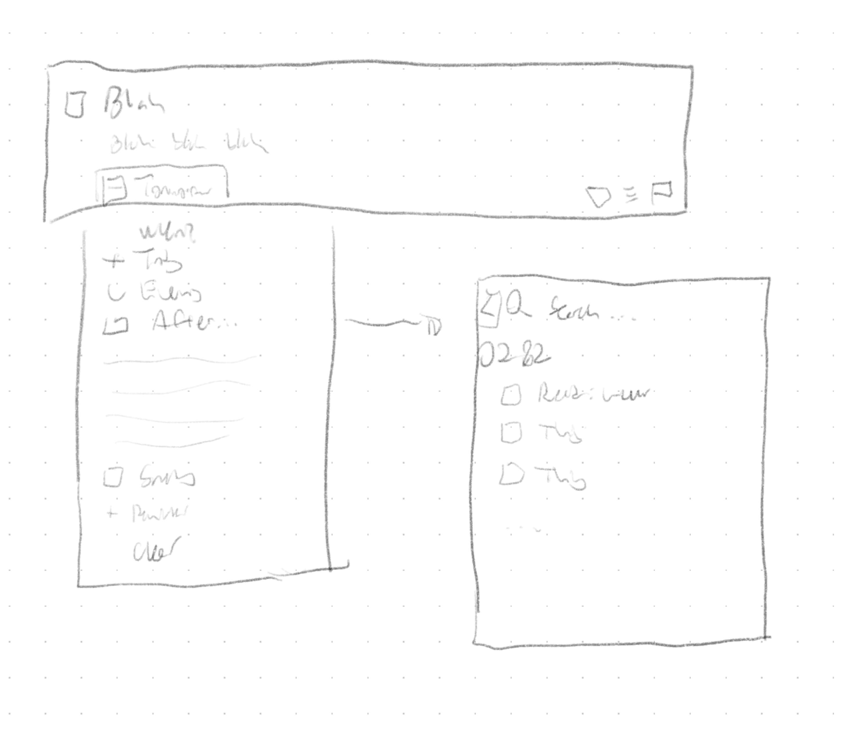
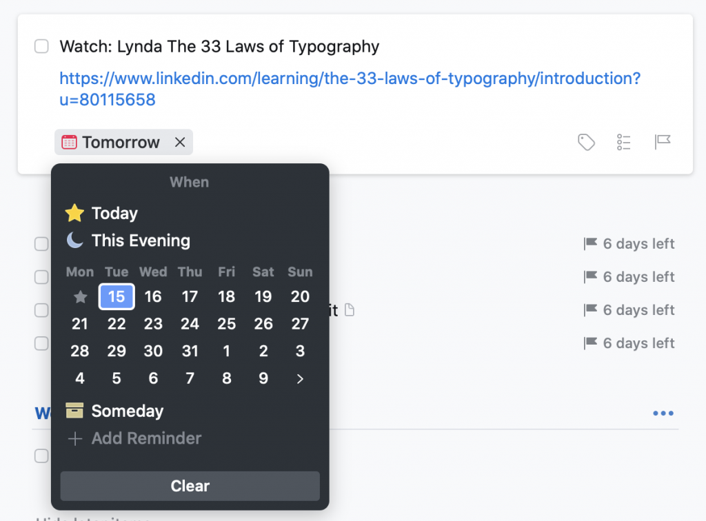
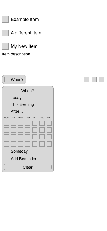
I kicked around a couple different ideas, but pretty quickly arrived at the conclusion that it should be integrated into Things’ ‘When’ menu.

The ‘When’ menu in Things. After opening it, you can either click to select an item, or begin typing, and use their natural language parser to choose a date.

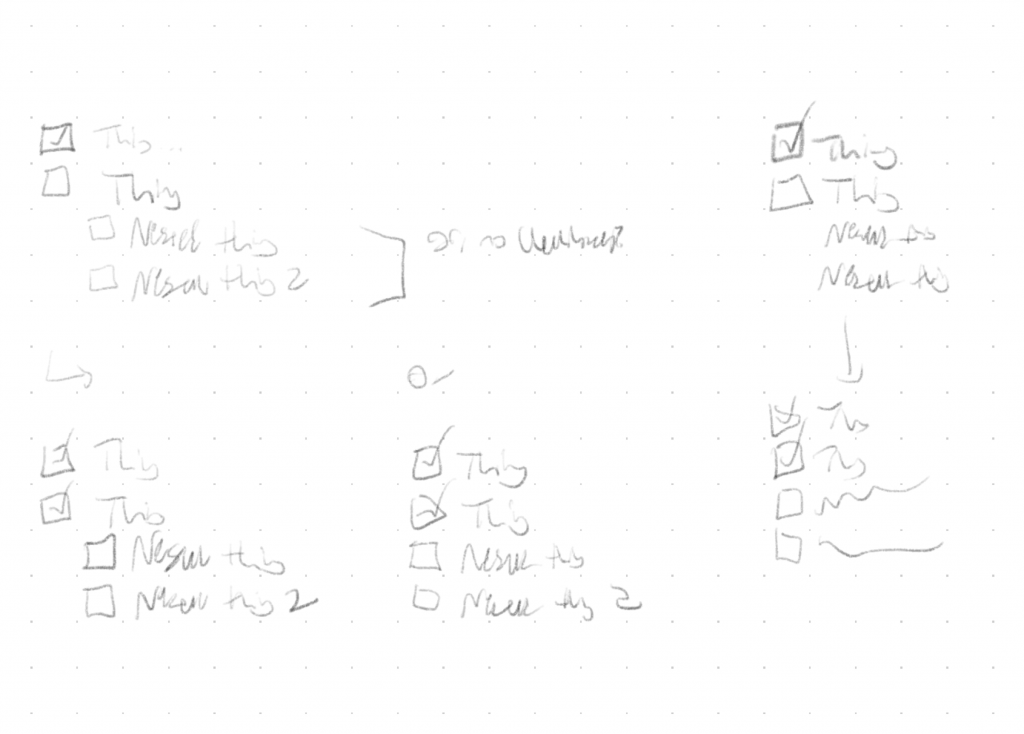
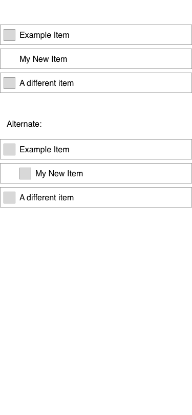
The other question was how to display these in the list. The point, of course, was that sequential items wouldn’t show up in the ‘Anytime’ list, but they do still need to be visible in some circumstances – namely, when you click through to the project itself, future items still show up.

In the ‘Anytime’ list, that third item wouldn’t appear; you could find it either in ‘Upcoming,’ which is sorted by date, or within the containing project – which is where I took this screenshot.

I actually tried a couple variations – it’s at this point that, were I working for Cultured Code, I’d say “we should build both versions and do some testing to see which is better.” I’m not, though, so I just wireframed them both and turned in the result.

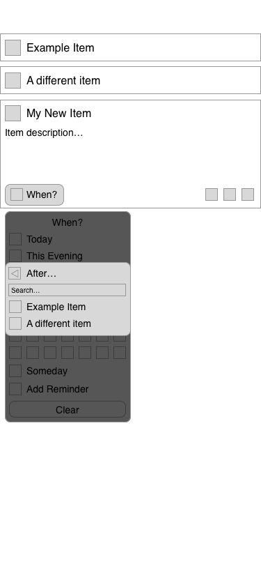
I’m fairly happy with the way I integrated it. Clicking, tapping, or typing “After” pulls up a second menu, where you can search for the item you want to attach to. Instead of thinking about it in terms of the project, the mental model is just “after x, I’ll do y.”

All told, I really enjoyed this exercise – it was the first wireframing I’ve ever done in Sketch, and it was neat to think about integrating a feature into something I use all the time. (And, hey, Cultured Code, if you’re reading this: feel free to use this idea, because I’d love to have the feature.)

Categories
Review

“Things 3”, or, “it’s like they brought the best of Material Design to iOS”

So, in my last post about what apps I use I gave a fairly glowing review of Things 2, my to-do list app of choice. The third version of the app has finally been released, and now that I’ve been using it for a few weeks I figured I’d give it a bit of a review.1
Things is a suite of apps: it’s available on macOS and separately on iPhone and iPad. They’re linked together by Things Cloud, a free account for a service that works incredibly well.
The main paradigm hasn’t changed all that much since Things 2: it’s still (roughly) a Getting Things Done style, with the centerpiece being the ‘Today’ list and the various Areas of Responsibility. The biggest change, aside from the UI, is how Projects are handled: you can now create subheadings within projects, to keep everything a bit more organized, and each individual task can now have a ‘checklist’, so you’ve got another layer of hierarchical organization to take advantage of.2
Where Things 3 really shines is the UI, and it’s pretty clear why it took Cultured Code so long to release a new version: a ton of work went into it. To be honest, my main guess about what happened is “they started work on an Android version, then quit on that to go back to working in the Apple ecosystem, and stole all the best ideas from Material Design along the way.”3 Adding a task is as simple as the plus button that now lives in the very reachable bottom-right corner; if you want to put it somewhere specific, you drag the plus button over the area you’d like the to-do to go, and it gets smoothly inserted there. Drag an item to the right to schedule it for a later date – or to set a reminder at a certain time of a day, another new (and much-awaited) feature – and to the left to send it to an Area or delete it. Projects are even easier to work with, thanks to a filling-circle motif for their completion status.4
Getting somewhere is easier, as well – on macOS, you can just start typing, and as long as you didn’t begin with the spacebar5 it starts searching in your Areas and Projects for whatever list you’re typing. iOS includes the same mechanic, with the added step of pulling down6 to open the keyboard.
Beyond that, it’s just little touches that make everything nicer: the UI as a whole is brighter and more open; setting the ‘when’ for an item on macOS accepts natural language input, so I can just start typing ‘tomorrow’ and it’ll know what I mean; you can close the sidebar, or pull it open wider, on macOS. The biggest win for me is the ‘Upcoming’ view – it links in with your calendar7 to show events as scheduled8 alongside all of your Scheduled items and anything with a due date. OmniFocus has had a feature like this for a while, and it was one of the biggest things that almost got me to switch, so seeing that come to Things is delightful; it’s nice being able to see the whole week (or as far as you’d like) in advance.
All told, I consider Things 3 a great update to a great app, and I can happily continue to recommend it. If you don’t have any sort of to-do list manager, pick it up on your iPhone and Mac; if you’re all-in on it, like me, or are just one of those people who can actually get all of their work done on an iPad, get it there too.


  1. This blog used to be for stuff other than reviews, but I’ve run out of fun travels and I don’t do much else so… here we are, I guess. 
  2. It’s nice for, say, a grocery list: going grocery shopping is only one Thing To Do, so it makes sense to keep it as a single item, but you still want to be able to check off the various items you’ve got to buy. 
  3. And yes, that’s where I got the title of the post from: roll credits. 
  4. It’s reminiscent of the way Things 2 handled Projects in the ‘Projects’ view of the macOS app, with a progress bar filling the space behind the name, but now consistent across all of the apps. 
  5. Which remains the ‘add new’ shortcut, so you won’t even need to rewrite any muscle memory. 
  6. Think ‘pull to refresh,’ it’s a pretty standard pattern in iOS. 
  7. Very easily, too; macOS and iOS include some very nice calendar APIs 
  8. That link also makes an appearance in the Today view, where you get a quick overview of your schedule for the day; if I didn’t add calendar events as often as I do, I could actually stop having Calendar.app open on all of my devices all of the time, and let Things handle that as well.