Categories
Technology

State of the Apps 2020

I suppose I’m making this a tradition, now, writing up what I have on my phone and what’s changed since last year. And why not? It’s fun, and it helps me a bit with the fact that I’ve let my blog post queue get very near empty.

Screenshot of the iOS 14 'today' view, showing several widgets.
Screenshot of an iPhone home screen, with a mix of widgets and applications.

This year saw the release of iOS 14, and with it, the ability to put widgets directly on your home screen, and to banish apps from your home screen to the App Library. Both of which I have pretty thoroughly taken advantage of – though I’ve only got the one page of apps, I almost certainly have more apps installed this year than I did last year.

Widgets

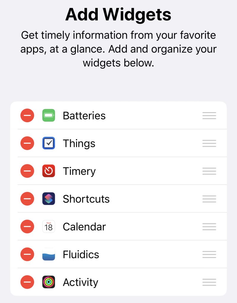
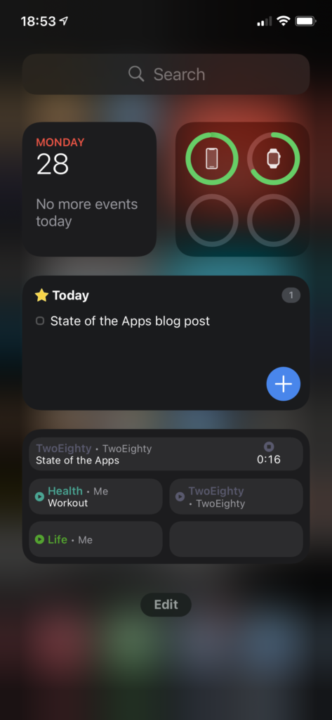
Let’s do a quick look at my ‘widgets’ screen. I believe the official name is ‘Today View,’ but that’s a piece of information that I’m going to estimate seven people outside of Apple know off the top of their head, so we’ll move right along.

The upper half is a dashboard; at top left, we have a Smart Stack, showing Calendar above, and beneath it are a pair of Timery widgets that show me totals I want to keep an eye on throughout the day.

Top right, batteries; I used to think the idea of the bigger battery widget was ridiculous, but if I do everything precisely wrong, I can overwhelm it – think, phone, watch, AirPods with distinct battery levels, and the AirPods case, to boot. Still, I like that at-a-glance view, and I actually like that it doesn’t show percentages, it feels a lot lighter as a result.

Below that, I’ve got another Stack with a pair of Things widgets, showing my Today and Upcoming lists. I originally had a couple of my Areas displaying, as well, but found I wasn’t really using them.

Finally, I’ve got another Stack, this time a pair of the larger-form Timery widgets. The one you’re seeing is my “my projects” collection – including a deliberately-blank bottom-right, so that with a timer running I’ve still got a way to tap into the app without starting or stopping a timer. 1 The other one, which I won’t be showing for “NDA” reasons, is stuff for work.

Home

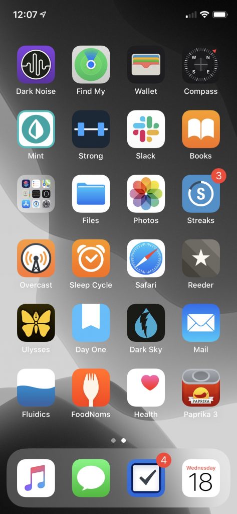
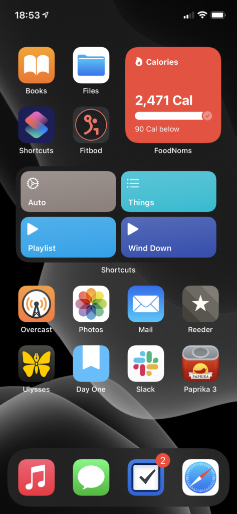
Now the home screen, which my mental model has in five segments.

The four apps at top left are the “aspirational” section – Books, as I’m trying to train myself to reach for a book rather than searching the web for Content to keep myself entertained; fitbod, as part of my ongoing fitness routine/goals; Shortcuts, because I want to be free to automate tasks with ease; and Files… doesn’t particularly fit the theme, but I use it often enough for it to have earned that spot.2

Top right is the ‘health’ pile. It is, you guessed it, yet another Smart Stack.3 Topmost is FoodNoms, which I still heartily recommend to anyone who wants to start calorie counting.4 Below FoodNoms we have Streaks, which I’m using less than I did last year, but I still find it helpful. Despite the fact that I’ve been taking the same meds every morning for several years now, I still forget at least once a week, and Streaks is what reminds me. Finally, at the bottom, is Activity, which I think you could call one of the canonical widgets of the new style – a glanceable bit of information, always there.

Below these two we have… an unnamed section.5 It is, once again, a Smart Stack. On top we’ve got my main-use Shortcuts – the bottom two for playing music, ‘Things’ gives me a menu of various Things items/projects that I use semi-often, and ‘Auto’ is a lovely piece of work that does what Siri Suggestions was advertised as doing.6

Below Shortcuts is Weather. Apple’s Weather app still feels a little lacking in accuracy compared to Dark Sky, but I’m hoping they’ll rectify that (and get their display of “amount of rain” lining up with my actual expectations for what it means, a la Dark Sky) before they disappear Dark Sky entirely. The widget, though, makes me want to write a chapter for a UI textbook about how well it contextually displays information.

The final item in this stack is Fluidics. It’s not just shameless self-promotion, it’s also dogfooding! (And I really do think the widget is a beautiful piece of design, if I do say so myself.)

The bottom section is Regular Ol’ Apps.

  • Overcast is holding steady as my podcast app. I’ve finally gotten below 5 gigs of podcasts downloaded to listen to, so in the next month or so I expect Chase to finish convincing me I need to download the entire back archive of Roderick On The Line.
  • Photos has actually grown in how much I’m using it – I decided to go all-in on it this year, and spent some time loading a bunch of the photos from my DSLR archives in, and some more time labeling faces so the ‘people’ album would work. I’ve had mixed results.7
  • Mail. What do you want me to say? It’s Mail, and I wanted the most boring of email apps.
  • Reeder I’ve updated to version 4, and am continuing to drive the actual RSS sync off of TT-RSS/Fever on my Synology. The one addition is RSS-Bridge, which I’m using to scrape a few Twitter feeds into RSS as well. I’ve also finally moved wholesale into Reeder’s Read Later service, leaving Instapaper behind.8
  • Ulysses still fulfills the same use case for me. I’ve found it to be a… reasonable editor for GitLab Wiki articles, and a much better viewer for them than GitLab itself.9
  • Day One has continued to expand the list of things I use it for. I think the most interesting is a pair of journals I’ve got – “Inbox” and “Archive.” “Inbox” is in as dark a theme as I can make it, and is the default journal on my phone; any time I’ve got a midnight idea, I jot it down in there, and once a week or so I’ll go through, processing things from “Inbox” into “Archive.” It’s a nice little workflow.
  • Slack made its way onto my home screen courtesy of MHCID, and remains there because it’s the main way I communicate with some of the friends I made through the program. It’s a much better UI than Teams.10
  • Paprika might belong in the ‘aspirational’ category in place of Files. I’ve got more than a thousand recipes in here, and I’ve made, like, twenty of them. One day…

Finally, we have the dock, which is only a visual distinction given that I’ve only got the one page.

  • Music remains a very important thing to me, and I’m in and out of it all day. Every time I use it, I miss when Apple allowed you to customize the tabs – they have five tabs in there, and I literally never use three of them. Let me have playlists as a top-level tab, Apple, please. Stop trying to make Radio happen.
  • Messages is the only social network I’ve got, these days. It’s nice to see Apple putting effort into it – I am a heavy user of threads and tapbacks.
  • Things is a stalwart as my task management app. Outside of drawing apps, it’s the only iPadOS app that does handwriting recognition correctly – you just start writing, anywhere on screen, and it reads it in.11
  • Safari, because what would an iPhone be without the internet communicator? Admittedly, my Safari is a very different Safari than most peoples’, because I’ve got a mountain of content blocker rules via 1Blocker, and on top of that I have JavaScript disabled.12
  1. You may have noticed that the Timery app icon isn’t present on my home screen – I like this way of getting to it.
  2. I suppose you could call it part of the Automation subcategory, considering that I’ve got a lot of iCloud Drive -> Hazel stuff going on…
  3. I absolutely love the stack mechanic; my only complaint is the little bit of animation-delay between when I finish swiping and when I can tap to interact. Yes, Apple, the little ‘settling into place’ animation is lovely… but I’m trying to do things, so get it out of my way and let me do them.
  4. It’s a beautiful, and very iOS-y piece of work. The food database isn’t as full as MyFitnessPal’s, but that’s honestly a good thing – MFP’s database is full of trash data. FoodNoms starts with the FDA’s database, and has a ‘community-sourced’ database on top of that, where every entry has been manually validated, so it’s solid. If something isn’t in there, tap a button and scan the nutrition label, and the app reads the whole thing in – and then, once you’re done, asks you if you want to submit the resulting data to the community database. It’s an incredibly slick interaction, and I adore it.
  5. I wasn’t really planning on the naming at all when I started writing this, so it makes sense that I’d run out eventually.
  6. The tl;dr version is “it checks the time and some other contextual information and automatically picks from a list of other shortcuts to run based on that.” My morning routine is a series of single taps on that button, and it feels downright magical.
  7. It can identify my grandmother with ease, regardless of if the photo is from this year or a scan of one of her wedding photos; my grandpa, on the other hand, it can’t spot if I give it two of the same photo and manually tag him in one.
  8. I’ve still got Instapaper connected to Reeder, on the off chance that I have to use the Windows machine my work provided, but I’m something like 99.5% on macOS these days, so that’s exceedingly rare.
  9. We’ve got a wiki monorepo kind of thing at work, where we’ve got articles on anything that may be useful. GitLab’s wiki can show something like 15 pages at a time in the list, and makes it rather difficult to find that list at all; they really didn’t expect anyone to use it like this. However, you can sync the whole thing, like any other repo, at which point you’ve got a regular ol’ folder full of Markdown files, and Ulysses handles that pretty well. It does have a bad habit of escaping escape characters, and I know I’ve got at least one file somewhere that opens with something like 30 backslashes before a single tilde. Whoops.
  10. Teams, which we use at work, isn’t on my phone at all. Maintain that work-life balance, folks.
    While I’m talking about Teams: the UI, across the board, feels like exactly as many little “oh, nobody thought about how this interaction would go” and “oh, nobody tested this” moments as I expect from any Microsoft product. Unfortunately for my distaste for Microsoft products, it has one notable advantage over Slack – calling support. Slack’s iOS app still doesn’t support video calls, so for actual workplace purposes it’s effectively useless. (And yes, I am hoping someone at Slack will cite this as evidence to give the iOS app the resources it needs to get that feature.)
  11. This has been a subtweet at Messages, whose support for handwriting recognition consists of “you may write up to two words, and you’ll probably drop the iPad trying to do it.” If iPadOS 15 doesn’t make the entire thread pane a valid handwriting recognition target, I’m going to have to write Tim Cook some very unhappy emails.
  12. And this is a subtweet at every news site that either entirely fails to render without JavaScript, or doesn’t load images without JavaScript. You are weak, and I scoff at you.
Categories
Technology

State of the Apps 2019

Inspired by CGP Grey’s post that started a Cortex tradition, here’s the current state of my phone:

This is… a work in progress. I got this phone in September, and while it’s been on my mind to do a full reorganization, I haven’t had time to do a full “tear it all down and start from scratch” process. The top two rows, especially, are very temporary — for the first time since iOS 7 came out, I’ve disabled Reduce Motion, and the parallax makes the fake invisible icons trick look terrible.
So rather than go through things in top-to-bottom, right-to-left order, I’m just going to talk about them in whatever order strikes my fancy.

  • Things remains my task management app of choice. I love it across all platforms, and happily recommend it to anyone who’s looking for something more robust than Reminders or a list in Notes. For me, it strikes the right balance of features without getting too heavy, and while I’ve got one or two things I’d like to see added, I have no great complaints.1
  • FoodNoms has been a very nice addition – it replaced Calory, which had replaced MyFitnessPal, which had replaced Lose It!. I’ve got a long history of tracking food, and while I quite liked Calory, FoodNoms is the first time I’ve gone “ah, never mind, don’t need this” and tossed out my notes on how I would build a food-tracking app. I haven’t yet gone for the subscription, because it just doesn’t have any features that interest me, but based on the rate of development, I’m expecting to make that change within the next few months.’
  • Timery is another stellar addition. It’s in that same category as FoodNoms — I had some sketches started of how I’d make an app in this category, and Timery made them completely irrelevant. The last two updates have added some truly excellent Shortcuts integrations — the last one added conversational shortcuts, so I can now just say “Hey Siri, Toggl” and talk through starting a timer with a specific project and description, or kick off a few frequently-used ones with a short phrase. The newest updated added some more programmatic stuff, and I’m planning to take some time over Christmas weekend to rebuild my old Toggl shortcuts, based on Federico Viticci’s examples, with Timery instead of custom web API calls.
  • Toolbox Pro – speaking of Shortcuts, Toolbox Pro is a neat little collection of Shortcuts actions. I’m most excited about the Variables feature, which I’m hoping I can use to improve some of my daily automation stuff.
  • Mail has replaced Airmail. I’d been vaguely looking for a replacement for Airmail, because it had a nasty habit of crashing all the time, and then they did a terrible job of switching to a new business model, and I threw my hands up in the air and decided to try the system default. It’s been working perfectly on iOS; on macOS, I’ve got a cobbled-together system using BetterTouchTool that sorta gives it real keyboard shortcuts,2 and a launchd script that relaunches it when it crashes.3
  • Day One remains my stalwart for journaling, but I’ve been slowly increasing the things I use it for. It’s my archive of Instagram, where I store my sketches, and the app I used to record some interviews I did for class.4
  • Ulysses is where I’m writing this article! It’s still my go-to for any long-form writing, and I love it. I haven’t yet made much use of their recent ability to store Ulysses files in Dropbox (or other arbitrary locations on disk), but I do have a collection of plain-old-markdown files that I edit in Ulysses on my Mac and Sublime Text on Windows.5
  • Reeder is a continuation and an addition all at once — I’ve been using it on my Mac for a while, but didn’t have it on iOS. I hit the maximum number of feeds on the free level of Feedly, and was extremely unimpressed with their paid offerings; I considered making a second account to keep syncing, but decided that was sorta rude to them, and instead opted to not have sync at all. That worked for a while, and then I got a Synology, and after setting it up as a Plex server, spent some time looking into RSS server options. At the moment, I’m using TT-RSS with a plugin for Fever support, but if anyone knows of something that’s easy to set up and has Google Reader API support, I’d appreciate it.6
  • Dark Sky’s recent redesign has me pretty happy. If they let me reorder the types of information, I’d be happier, but the clarity of the “when is it going to rain” charts is still excellent.
  • Overcast remains my podcast app of choice. Podcasts have been a great way to help me establish a gym habit — I established a podcast habit, and then decided that podcasts are things I can only listen to while driving, cleaning, or working out. (If you want podcast recommendations: Cortex, Do By Friday, ATP, 99PI, and MBMBAM are my mainstays.)
  • Strong, speaking of a gym habit, is the driving force of my time at the gym. A couple of my friends have been helping me out with designing actual workout programs to do, but Strong is where I put those in. It’s easy to use, remembers all the numbers so I don’t have to, and has instructions, often accompanied by images or GIFs, on a lot of exercises.
  • Streaks is where I track all my habits, from “did you remember to take your meds” to “do some writing for your blog” to “have you gone to the gym enough times this week?” It’s very good at what it does, and I’m still a fan.
  • Fluidics is a bit self-serving to include here, but I use it all the time. I’m planning to update it eventually — I’d like proper Dark Mode support, at the very least — but it’s hard to find the time.
  • Wallet has gotten more and more important over time, though not as fast as I’d like it to. Let me put my driver’s license in there, already. Apple Card is slowly taking over as my main credit card, Apple Cash is even more handy with the cash back in there, and it’s not too hard to make your own pass of your gym membership.
  • Sleep Cycle is possibly on it’s way out; I’m strongly considering getting a beddit, although I need to do more research — does it have the ‘smart alarm’ feature? How accurate is it? Is Apple going to kill the app soon? Lots of questions.
  • Dark Noise is a new addition in the past few days; I’ve been switching from a ‘sleep’ playlist to white noise in an effort to get Apple Music’s recommendations to not be entirely useless.7 I tried to use Sleep Cycle’s white noise feature for a while, but it assumes that I want the white noise to stop after a while, which is absolutely not the case. Dark Noise’s actual noise is a bit less interesting overall, which is possibly the point, and the app itself is delightfully well-made.

  1. I was, admittedly, tempted by OmniFocus, because OmniFocus for Web means I could have a single unified system across my Mac, iOS devices, and work PC, but it’s still just too much for my needs. And expensive. 
  2. Listen, Apple: you can either comp me the cost of getting a new keyboard that’s got the Inverted T arrangement for the arrow keys, or you can let me go from message to message using j/k. (And even if they did give me a free keyboard, I’d still complain; I’ve been using j/k to get around for two decades now, and it’s just easier.) 
  3. And on Windows, both Outlook and Windows Mail crash frequently, too; apparently IMAP, despite being 30-something-years-old, is still an unsolved problem? 
  4. In typing this, I’ve just realized that I think I’m using Day One the way Evernote wants to be used. Huh. 
  5. All synced by Git, because… why not? 
  6. The Fever API neglected any form of subscription management, and needing to pull up the TT-RSS frontend in a web browser whenever I want to add or remove a subscription just feels silly. 
  7. Fun fact: the “use listening history” setting that all Apple Music clients have? Doesn’t appear to do anything. Neither does “stop recommending music like this.” 
Categories
Tools

Recipes

Cooking! Once you’ve figured out the basics (don’t put stuff in the oven and forget about it, the result is, at best, your house smelling like burnt sadness for a while), it can be pretty fun.1
A lot of the cooking you do can be “let’s see what’s in the fridge and pantry and make something out of that,” but there’s also a lot to be said for working from a recipe.2
You can, of course, go old-school, have a huge stack of cookbooks and magazine clippings and handwritten notecards. Personally, I’d call that giving in to my pack-rat tendencies a bit too much, so I prefer to go digital.3
My recipe management software of choice is Paprika; they’ve got a Mac app, too, and I believe a Windows app?4 Regardless, it’s pretty easy to put stuff into, and they’ve got some nice stuff for actually cooking with (check ingredients off as you go, automatic conversions, multiple timers, it’s almost like the app was made for this).
When you first open it up, it can be a bit empty, and their suggestion of “putter around the internet and find some stuff to get started” didn’t quite work for me. You remember that mention of cookbooks and clippings and notecards? That’s what we used to have; now it’s a much more compact setup, and I’m quite willing to share. About 900 recipes, neatly organized to help you start off your collection. Enjoy!


  1. And, as a fun bonus, it’s generally cheaper than buying ready-made food! 
  2. Especially if you’re baking; cooking is an art, baking is a science. 
  3. Same amount of stuff, but much easier to search through! And the storage is a lot cheaper, too. 
  4. You can tell how long it’s been since I used Windows, not by the fact that I don’t know, but by the way that I don’t know if they’re called apps on Windows or not. Program? Software? Who knows. 
Categories
App

Fluidics 1.2: the Settings Update

I’m happy to announce the release of Fluidics 1.2! This update focused on the settings of the app and customizability; the quickest summary I can give is to include one of the new App Store images:

The first thing to notice is the new cards; they come up from the bottom of the screen, which is a much nicer experience on really tall devices like the iPhone X, and offer a more customizable interface than iOS built-in popup stuff.1
There’s some uses of the cards that I’m not showing here — I rebuilt the onboarding process, that initial setup you go through the first time you open the app, using this card style, and the result looks a lot nicer. There’s also some informational stuff — a new ‘about’ card, the weight/Health connection stuff, and so on — but the biggest things are the two cards in that screenshot. The first is, in my opinion, the more interesting: each Quick Add now has its own unit. If you’re content with the old system, all of them using the same unit, nothing’s changed; the text of the buttons is a bit bigger, but there’s no additional use of space. If you, like me, use a mix of units,2 you’ve now got the option to do that in one place, without needing to go over to the Settings page to switch back and forth all the time. These mixed-unit quick adds, as always, work both from within the app and from the widget.3
Next up is the new Display Settings card; this brings in features I’ve been wanting to have for a while now. Some of the original settings are still there — you can, as before, show or hide the help as you need it, and the ability to select the global display unit has been expanded to include liters as well as mililiters.4 There’s some new settings in there, too: you can choose which page of the app will come up when you first open it — useful if you’ve got your Quick Add values set just right to always work with the widget, and you only need to get into the app to add the occasional weird amount via the Custom Add page. You’ve also got the option to hide the goal display — you’ll still get the nice filling-up of the background, but without the actual number right there, it’s a lower-pressure environment.5 Finally, you can disable the animation of the background; though I spent quite a while making sure it’d work, I know that some people don’t actually want lots of animations going on.6
I also put a bit of polish on the way the Health connection works, so now it’s a single button in Settings that opens up a different card depending on the context — if you haven’t done all the connecting to Health, it’ll give you the option to do that, or leave things as they are; if it is connected to Health, but you haven’t got your weight logged there, you can continue using Fluidics’ built-in weight handling stuff. That’s been improved, as well, and now lets you pick units yourself, instead of going with the default for your region.7
Not mentioned in the release notes, but something I feel like mentioning here, is that I’ve done a bit more groundwork to prepare the app for eventual internationalization. There’s still a lot more ground to cover in that regard, though, so probably I won’t be adding additional languages for another couple versions.8
All that said, I’m pretty happy with where this version is, and I’m also excited to start work on the next big update; the feature list I’m aiming for is pretty neat. Fluidics remains free on the App Store, so please, give it a download.


  1. The specific implementation I’m using is this open-source project; I liked the way the API worked, though the documentation is a bit out of date. 
  2. Because ‘Murica. 
  3. Unfortunately, I had to reset the quick add settings as a result of this transition; the new way they’re stored is thoroughly incompatible with the old way. If you were just using the default ones, you won’t notice any change, but I wasn’t able to come up with a good way to transfer over customized settings. The issue is people like me, who used fluid ounces sometimes and milliliters other times; there’s no good way to combine eight possible options into four spaces without messing something up for someone. 
  4. I also tweaked the way amounts are displayed, so using mixed unit stuff doesn’t result in a downright stupid amount of decimal digits; I don’t think it really matters to anyone that you’ve had 101.327 fluid ounces to drink today, probably you’re alright with just 101.3. 
  5. There’s probably a joke in there about hydraulic pressure, but I’m too lazy to come up with it. 
  6. By default, it’s on, unless you have ‘reduce motion’ enabled on your phone, in which case it’ll default to having the animation disabled. That said, if you’re like me and have ‘reduce motion’ on just to get rid of the somewhat-nauseating parallax effect on iOS’ home screen, you can turn Fluidics’ animation back on while still leaving the global ‘reduce motion’ setting on. Nitpicky details, woo! 
  7. Shoutout to the UK, who can now use pounds, kilograms, or stone for weights; I may mock the US for our weird use of mixed units, but I think the UK is even worse about that. 
  8. At that point, it’ll probably be Spanish and German, since those are the ones I can manage without hiring a translator, but if anyone really vehemently wants a different language, feel free to leave a comment and I’ll see what I can do. 
Categories
App Portfolio Technology

Fluidics 1.1: The Animation Update

The first major update to Fluidics is now available on the App Store!1 In all honesty, it was largely a ‘bug fixes and performance improvements’ update, but I’ve always hated when app updates list that, so I made sure to include a couple user-facing features so there’d be something fun to talk about, at least.
In this case, those features were animations. The most notable is the background – rather than being drawn once, the ‘water’ in the background is now animated, which I think makes the visual effect much nicer overall. Swiping between the three main pages of the app is also much smoother now; instead of a single ‘swipe’ animation being triggered by any swipe, it directly responds to your swipe, so you can change your mind about which direction to swipe halfway through, and it feels more like you’re moving things around, rather than switching pages.2
The big changes, though, are largely invisible; a whole lot of work on the internals to allow for future features I’m planning.3 The gist of it is that a lot of the internals of the app are now a separate library, which means I can share code between the widget and the main app without needing to copy-and-paste all the changes I make in one place to the other.
Past that, there were a couple little tweaks — the algorithm that calculates the water goal is a bit less aggressive with the way it handles workout time, and there’s now a little “this isn’t a doctor” disclaimer in the Settings page that I put there because the lawyer I don’t have advised that I do that.
And, the bit that turned into more of a project than I thought: VoiceOver support. VoiceOver, for those that don’t know, is one of the core accessibility features of iOS; when enabled, it basically reads the contents of the screen to the user, making it possible for visually-impaired people to use iOS. By default, any app built on UIKit has some support for VoiceOver, but the further you go from the default controls, the more broken that’ll get. The way Fluidics works, it was super broken; technically useable, but downright painful to do. After a day or two of vigorous swearing and arguing with the Accessibility framework, I’m proud to say that Fluidics is now VoiceOver-compatible.
If you’ve already got Fluidics on your phone, it’s a free update from the App Store.4 If not, the whole app is a free download from the App Store, and I’m hoping that you’ll enjoy using it. Leave a review or whatever; I’m trying not to be pushy about that.
Oh, and I’m in the process of updating the app’s website; I got such a good URL for it that I want it to look good to match.


  1. There was a bugfix update earlier, version 1.0.1, but that’s not at all exciting, so I didn’t bother writing anything about it. 
  2. If you’re curious, this involved rebuilding the entire interface, from three separate pages that’re transitioned between to a single page that’s embedded in a scroll view. 
  3. And no, I won’t be telling anybody what those are just yet; I don’t want to promise anything before I know for sure it’ll be possible. 
  4. In fact, it may have already been automatically updated — the easiest way to tell is to open the app and see if the water is moving or not. 
Categories
App Portfolio Technology

Open-sourcing Variations

Now that the whole concert is over, and I’ve finished going through approximately all of the WWDC sessions, I’ve decided that Variations won’t be receiving any further development — it wasn’t going to be enough of a priority for me to do it any justice, and I’d hate to half-ass it.1 The app will remain on the App Store, for now, though if it breaks in future iOS versions, I’ll probably pull it entirely. Instead, I’m releasing the source code, as-is; if you’d like to look through it, it’s right here.
I had fun building it, and I like to think that it does some interesting things with the implementations under the hood, so hopefully somebody can find some use from it.


  1. This is, hopefully, a hint about some of my other projects that are a higher priority; announcements of those will, of course, show up on this here blog. 
Categories
App Portfolio Technology

Fluidics

I made an app! I’m quite excited about it; this is, after all, the sort of thing I want to spend my career doing.

The app is called Fluidics, and it’s for tracking the amount of water you drink. As I mentioned a while back, I like to do a lot of tracking of what I’m eating and how much I’m drinking. That first part wasn’t too hard; there’s a variety of apps on the App Store for logging food, and after a while I was able to find one that wasn’t too bad.1 For water, though, nothing quite worked – Workflow came closest, but using it to do the sort of goal calculations I wanted was on the line between clunky and painful, and it’s such a general-purpose app that it felt visually lacking.
Eventually I remembered that I’m a computer science major, and why am I sitting around complaining about the dearth of options when I’ve basically got a degree in making the dang thing. Months of sketching, programming, swearing, and repeating the whole thing eventually lead to this: what I hope is the easiest water-tracking app on the App Store to use.
It’s been a fascinating process. (Here, by the way, is where I’m going to take advantage of the fact that this is my blog for rambling and start talking about what it was like making it; if you’d like to get more information on the app, I’ve put together a rudimentary website, or you can skip straight to the ‘it’s free on the App Store’ part and give it a whirl.) As it turns out, there’s a whole lot of work involved in making an app; my original sketch was the widget and two screens. Those came together pretty quickly, but I realized that probably nobody would feel comfortable using an app if the first time they opened it it just threw up a message saying “trust me!” and then asked for a bunch of health information, so I wrote up a privacy policy and started building an onboarding flow. Which then ballooned in complexity; looking at the design files, more than half of the app is screens for dealing with something having gone wrong.2
One of the most interesting debates I had with myself during the whole process was deciding what business model to use.3 The App Store has had an unfortunate tendency to be a race to the bottom; while there’s a bit of a market for pro apps, a minimalistic water-tracking app doesn’t fit into that category. There’s also no argument to be made for a subscription, so I’d narrowed it down to ‘free, because I’m turning it in as the capstone project for my computer science major’, ‘free with ads’, or ‘paid up-front’. The first one was the one I was most comfortable with; sure, ‘paid up-front’ would be nice, but I’d also get approximately zero people to download it what with all the free competitors out there. ‘Free with ads’ feels deeply gross, both because I hate online advertising in general, and because I’m doing a lot with health data, and I really don’t want to have any chance of that getting stolen. For a while, I thought it was going to be ‘free forever’, and I’d be justifying it as ‘building a portfolio’.
That wasn’t what I actually settled on, however; instead, I’m going with ‘free with in-app purchase.’ Instead of building in a paywall and locking some features behind it, though, I decided I’d go simpler; the app and all of its features are free. Starting in version 1.1, there’ll be a button in the Settings; a little tip jar.4 I probably won’t make much, but I’ll feel better about it overall, and what’s the harm?
Beyond that debate, most of the challenge of the project as a whole was just building it. I knew going in what I wanted it to look like; what I didn’t know was how to go about doing that. The way the background overlaps the text? That alone took a week of trying different things to get working right.5 A few things I wanted to include in the first version didn’t make it – the widget was originally going to be entirely different, but the way Apple has done the security on health data makes the original design significantly more difficult to do, so I switched it to the current design.6
It was definitely a learning experience, too – I’d done some iOS application design for classes before, but never gone all-in on making something that would be both functional and enjoyable for the end user. If you’re releasing something on the App Store, you can’t just include a note that says “on first run, it’ll ask for a bunch of permissions; just say yes” because nobody will read that. And getting something uploaded to the App Store is itself a whole process – the App Store page doesn’t fill itself out, after all, and copywriting definitely isn’t my strongest suit.7
But it’s done; I’ve made an app and released it to the world. 8 By the time you’re reading this, it should be available on the App Store; as I mentioned, it’s free to download, and I’d love it if you’d give it a try.


  1. That said, I’m also doing some design sketches for my own entry into the field; don’t get your hopes up, I make no promises. 
  2. I’m not talking “my code is full of bugs and something crashed” went wrong, either; it’s all “the user originally gave permission to do something, but then changed their mind and used the Health app to take it away” and other such nonsense. Computers may be finite-state machines, but “eleventy hojillion” is still a finite number. 
  3. I also talked about this a lot with my friend Chase, without whom I would’ve long ago given up on technology and disappeared into the woods to be a Bigfoot impersonator.. 
  4. Yes, I know, I’m just now releasing version 1.0, and I’m already mentioning plans for 1.1. Don’t worry, I’ve got versions 1.2 and 1.3 mapped out, feature-wise, as well, and have some rough ideas for 1.4. 
  5. For a while I thought I was going to have to write code to draw the numbers ‘by hand’; fortunately, I was able to get the drawing to work by taking advantage of layer masks, but good lord are the Interface Builder files a mess as a result. Behind The Scenes, everybody! 
  6. I do still want to get the original design working, probably as an option in the Settings page of the app; a future version is going to add watchOS support, and I believe that a lot of the work I’ll have to do for that will also apply to making the widget work like I intended, so those two will either be the same or subsequent updates. 
  7. Another shoutout to Chase, who wrote the App Store description and turned my pile of 100 disjointed screenshots into the four that’re currently on display. 
  8. Well, “done”; it’s functional and available to the public, but software, as the saying goes, is never finished, only abandoned. I’ve no plans to abandon this project anytime soon; I use it myself several times a day, so I’m pretty invested in keeping it working and making it better. 
Categories
Review

“Things 3”, or, “it’s like they brought the best of Material Design to iOS”

So, in my last post about what apps I use I gave a fairly glowing review of Things 2, my to-do list app of choice. The third version of the app has finally been released, and now that I’ve been using it for a few weeks I figured I’d give it a bit of a review.1
Things is a suite of apps: it’s available on macOS and separately on iPhone and iPad. They’re linked together by Things Cloud, a free account for a service that works incredibly well.
The main paradigm hasn’t changed all that much since Things 2: it’s still (roughly) a Getting Things Done style, with the centerpiece being the ‘Today’ list and the various Areas of Responsibility. The biggest change, aside from the UI, is how Projects are handled: you can now create subheadings within projects, to keep everything a bit more organized, and each individual task can now have a ‘checklist’, so you’ve got another layer of hierarchical organization to take advantage of.2
Where Things 3 really shines is the UI, and it’s pretty clear why it took Cultured Code so long to release a new version: a ton of work went into it. To be honest, my main guess about what happened is “they started work on an Android version, then quit on that to go back to working in the Apple ecosystem, and stole all the best ideas from Material Design along the way.”3 Adding a task is as simple as the plus button that now lives in the very reachable bottom-right corner; if you want to put it somewhere specific, you drag the plus button over the area you’d like the to-do to go, and it gets smoothly inserted there. Drag an item to the right to schedule it for a later date – or to set a reminder at a certain time of a day, another new (and much-awaited) feature – and to the left to send it to an Area or delete it. Projects are even easier to work with, thanks to a filling-circle motif for their completion status.4
Getting somewhere is easier, as well – on macOS, you can just start typing, and as long as you didn’t begin with the spacebar5 it starts searching in your Areas and Projects for whatever list you’re typing. iOS includes the same mechanic, with the added step of pulling down6 to open the keyboard.
Beyond that, it’s just little touches that make everything nicer: the UI as a whole is brighter and more open; setting the ‘when’ for an item on macOS accepts natural language input, so I can just start typing ‘tomorrow’ and it’ll know what I mean; you can close the sidebar, or pull it open wider, on macOS. The biggest win for me is the ‘Upcoming’ view – it links in with your calendar7 to show events as scheduled8 alongside all of your Scheduled items and anything with a due date. OmniFocus has had a feature like this for a while, and it was one of the biggest things that almost got me to switch, so seeing that come to Things is delightful; it’s nice being able to see the whole week (or as far as you’d like) in advance.
All told, I consider Things 3 a great update to a great app, and I can happily continue to recommend it. If you don’t have any sort of to-do list manager, pick it up on your iPhone and Mac; if you’re all-in on it, like me, or are just one of those people who can actually get all of their work done on an iPad, get it there too.


  1. This blog used to be for stuff other than reviews, but I’ve run out of fun travels and I don’t do much else so… here we are, I guess. 
  2. It’s nice for, say, a grocery list: going grocery shopping is only one Thing To Do, so it makes sense to keep it as a single item, but you still want to be able to check off the various items you’ve got to buy. 
  3. And yes, that’s where I got the title of the post from: roll credits. 
  4. It’s reminiscent of the way Things 2 handled Projects in the ‘Projects’ view of the macOS app, with a progress bar filling the space behind the name, but now consistent across all of the apps. 
  5. Which remains the ‘add new’ shortcut, so you won’t even need to rewrite any muscle memory. 
  6. Think ‘pull to refresh,’ it’s a pretty standard pattern in iOS. 
  7. Very easily, too; macOS and iOS include some very nice calendar APIs 
  8. That link also makes an appearance in the Today view, where you get a quick overview of your schedule for the day; if I didn’t add calendar events as often as I do, I could actually stop having Calendar.app open on all of my devices all of the time, and let Things handle that as well. 
Categories
Collection

Word processors

Baldur Bjarnason:

I don’t write primarily in markdown because the format is nice but because markdown apps like Ulysses and Byword value the joy of writing as well as the need for structure. They recognise that writing is equal parts emotional and executive reasoning. Favour emotional logic too much and you get Apple’s glossy, wrapped-in-plastic writing experience. Favour executive reasoning too much and you get Microsoft Office’s kitchen-sink-included helicarrier.

I do all of my writing in Ulysses, and it’s a joy – full Markdown support, with one or two extra touches1 that make everything easy.
As to the Pages vs. Word debate, I tend to use Word – Pages is distinctly easier to use, but it lacks a couple features that I need whenever I’m using a ‘full’ word processor.2


  1. Like their footnote macro, which replaces markdown’s clunky [^footnoteID]/[^footnoteID]: content syntax with a quick, easy (fn) and typing into a popover. 
  2. And I have Office anyways, because the terabyte of OneDrive space and my need for Excel’s power features necessitate it.