Categories
Tools

The Self-Deprecation Jar

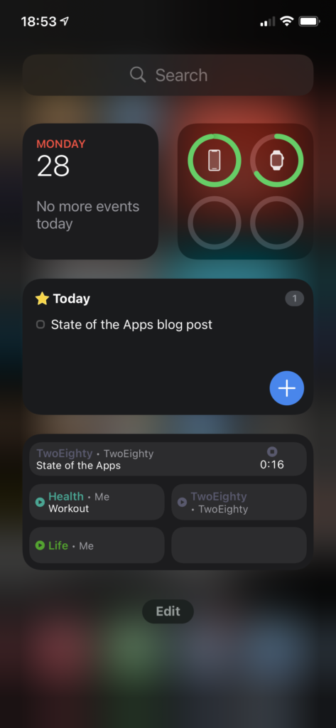
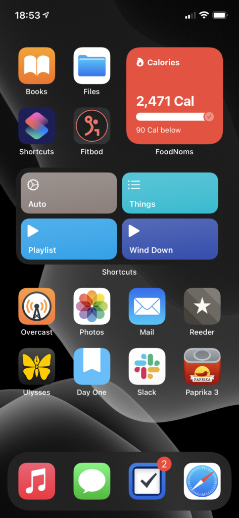
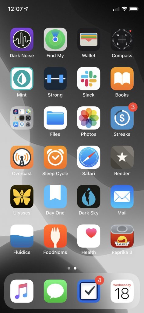
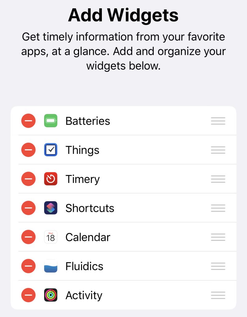
In the last few months, I’ve made surprisingly few changes to my home screen. One of them, though, was reorganizing what appears in the Shortcuts widget. I combined all my ‘playlist’ stuff into one Shortcut that checks what time it is and tries to guess what playlist I want, and then gives me a list of the options, in case it guesses wrong.1 With that additional space, though, I needed a new Shortcut to occupy the fourth slot. Can’t have an unbalanced home screen, after all!

What I eventually arrived at was the Self-Deprecation Jar. I can’t claim the idea as my own: I first came across it entitled “the self-depreciation jar,” but renamed it to reference self-deprecating humor.

The core idea is something roughly in the area of cognitive behavioral therapy, though I am emphatically not a mental health-care professional, so take what I say with a grain of salt.

The point, though, is that every time you say (or write, or think too loudly—pick a delineation that works well for you!) something negative about yourself, you put a dollar in the jar. (Or a quarter, or a penny—again, it’s meant as a very flexible system!)

I’ve found it a helpful thought technology: it draws attention, and imposes a negative penalty, on the sort of negative self-talk that’s far too easy to fall into. I suspect the former effect there is more meaningful than the latter, in the same way that people tend to have success toward their diet goals regardless of the diet, simply by paying more attention to what they’re eating.

Now, as a millennial, I own a great many mason jars… but I don’t actually own any cash. Instead, I put together a digital version of this in Shortcuts. In my implementation, I wanted to have the ‘cost’ be $1 put into my investment account—I’m still incurring an in-the-moment penalty, but the end result is a positive for Future Grey. Alternately, pull up a deserving charity and throw some money their way!2

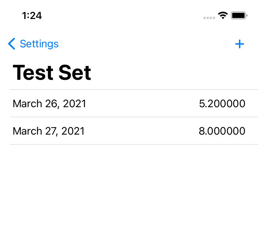
Now, I do that investing via Acorns (shameless affiliate link!), which has a minimum of $5 for a transfer, so the Shortcut had to be a bit more complex than just an “Open App” action. Happily, I have Data Jar installed, which makes it nice and easy to store data across runs of a Shortcut. A little modular math later, and we’ve got a Shortcut that, every time you tap it, increments a counter; and every time that counter is a multiple of 5, it opens Acorns and throws me a notification to say “hey, that’s five, put in $5.”

After a bit of tinkering with the Shortcuts editor, I’ve arrived at this version, which will prompt you to customize as necessary—tweak the frequency, the message, and what app to open, and you’re off to the races.

And, hey. Be kind to yourself. Remember: You’re a lovely human being, and the world is a better place for having you in it.

  1. It’s an educated guess, really, considering the way I structure my playlists and my day.
  2. I’ve shared this idea here and there, and a fairly large Discord I’m a member of now has a custom :jar: emoji that we bring out when someone is being self-deprecating. I will take approximately no credit for that, though, as it’s my friend Madi who took it upon herself to be the spirit of kindness in the server and remind people to take care of themselves.
Categories
Programming

Dev Blogs

I recently had someone ask for recommendations for dev blogs to fill out their RSS reader. After going through what I have in my RSS reader, I realized that this would make a good little post—these have all been helpful resources to me, so it seems likely they could be helpful to someone else. (I have also been informed by a friend of mine that I should include myself in this list, but I figure you’re already here. Go ahead and throw this site URL into your RSS reader, the feed is nice and discoverable.)

So, in no particular order, developer blogs:

  • Use Your Loaf posts fun little things, usually regarding iOS development.
  • The Always Right Institute does terrible, terrible things with Swift, and they’re consistently a delight to read.
  • SwiftLee writes very solid articles explaining various Swift language features, iOS API things, and general career tips.
  • Swift with Majid does weekly deep dives into SwiftUI… and may or may not be the inspiration for my recent spate of programming posts.
  • Swift by Sundell is one of the definitive Swift sites; not only does John Sundell write up plenty of great articles (see ‘Swift Fundamentals’ as a great starting point!), he also has a couple podcasts, if listening is more your style.
  • Reda Lemeden does some fun explorations of Swift, as well as more general things with his “This Week I Learned” posts.
  • Gui Rambo does some really neat explorations of what’s possible on iOS when he’s not cracking open the developer betas to see what features Apple forgot to feature-flag out of the build.
  • Povilas Staškus hasn’t posted in a while, but his posts are worth a back-read; the Jekyll-to-Publish migration was a fun one. And, hey, putting an infrequent poster in RSS is what RSS is for!
  • NSHipster is a venerable name in the iOS dev world; not as actively updated as it once was, but the back catalog is extremely solid, and will quite often be one of the first results when Googling various things.
  • Kristaps Grinbergs writes in a similar vein to Swift with Majid, with explanations of various parts of the SwiftUI API.
  • Julia Evans is a break from my very iOS-heavy list so far; she does comics and zines explaining general programming concepts, command line tools, and all sorts of stuff. Seriously good explanations, I recommend checking them out.
  • Brent Simmons blogs about NetNewsWire, life as a developer, and neat bits of history in the Apple world.
  • Steven Troughton-Smith may well be the expert on Catalyst apps; his recent post of various sample apps is a wonderful resource if you’re looking into bringing an iPad app to macOS.
  • Erica Sadun’s blog has recently been a lot of neat macOS automation stuff; she’s also a frequent contributor to Swift itself.
  • On Hacking With Swift, Paul Hudson provides excellent WWDC coverage and an amazing array of tutorials and documentation.1 If you’re just getting started, go through his free 100 Days of Swift and 100 Days of SwiftUI courses.

And, in addition to all those blogs, I also funnel email newsletters into RSS whenever possible. My top picks from that list are:

  • iOS Goodies provides a little commentary with a list of articles.
  • iOS Dev Weekly comes with much more commentary; I’m also a fan of the “and finally…” section, it’s a nice ending every week.
  1. Seriously, it’s so robust that one of my top bangs is !hws
Categories
Technology

WWDC21

I’m writing this a bit after WWDC has ended, and publishing it a bit further after that, so pardon the tardiness as I share my thoughts, in no particular order:

  • As a user, I am quite excited by the new functionality in FaceTime, and the new Focus system for managing notifications. The system of tiered notifications looks great, and I’m excited for the, oh, 15 minutes most people will have between ‘installing iOS 15’ and ‘an app first abusing the notification level to send them spam.’1 In iOS 16, can we get a “report notification as spam” button that immediately flags the app for App Review to yell at?
  • As both a developer and user, I was immensely excited to see the ManagedSettings and ManagedSettingsUI frameworks – I really like the concept of Screen Time for externalized self-control, and being able to use custom implementations or build my own seemed like a dream.2 Unfortunately, all those dreams were immediately crushed by the reveal that this all requires FamilyControls, so not only can I not do anything interesting with it as a developer, I can’t even use it myself. Because, as we all know, the only use case for “my phone won’t let me use it to waste time” is “parents managing their children.”
  • Swift’s implementation of async/await looks great, and the stuff Apple’s doing with @MainActor seems to have met the goal of “the language eliminates an entire class of error” that initially gave us optionals, so I’m quite happy about that. I hope Vapor updates to async/await soon, I’d love to untangle some of my flatMap chains.
  • The new Human Interface Guidelines section on Inclusion is very well-written and hits on some important points.
  • I am incredibly excited about the virtual KVM thing coming to macOS and iPadOS – my desk setup features two monitors for macOS, and an iPad perpetually on the side, and the idea of being able to control the iPad without taking my hands off the main keyboard and mouse is very exciting.3
  • Safari on iOS got support for web extensions, which is neat. I also like that they’re pulling things down toward the bottom of the screen, should be more reachable.
  • Safari on macOS might finally do something that Mozilla never managed to do: convince me to switch to Firefox. I sincerely hope this is the peak of “aesthetics over functionality” in Apple’s design, and that it gets better from here, because this is a mess: lower contrast text, the core UI element moves around all the time so you can’t have any muscle memory, and they’ve buried every single button behind a ‘more’ menu.
  • SwiftUI got lots of little updates, but the thing that I may be most excited about is the simple quality of life improvements as a result of SE-299.listStyle(.insetGrouped) is much easier to type than .listStyle(InsetGroupedListStyle()), especially considering that Xcode can actually suggest .insetGrouped.
  1. In my case, it’ll probably be a couple days, and then Apple Music will punch through a Focus mode to notify me that Billie Eilish has a new single or something.
  2. I already have a name for the app I want to build using these API. My first feature would just be “the existing Screen Time system, but it actually knows how time works.” Something like 90% of the time that I hit ‘one more minute’ I’m instead given a couple seconds. Apple, I know that time is hard, but it isn’t that hard.
  3. Why the iPad? Because iPadOS is sandboxed, which limits the sort of bugs that Teams can introduce and evil that Zoom can. Sure, they both have macOS apps – but you shouldn’t install either of them.
Categories
Programming

Playing Videos in SwiftUI

As of WWDC 2020, we have a way to play videos in SwiftUI without bailing out to UIKit with UIViewRepresentable. At first glance, it’s pretty simple, as well:

import SwiftUI
import AVKit

struct VideoPlayerView: View {
	let videoURL: URL

	var body: some View {
		let player = AVPlayer(url: videoURL)
		VideoPlayer(player: player)
	}
}

Et voila, you’re playing a video! You can overlay content on top of the video player pretty easily:

import SwiftUI
import AVKit

struct VideoPlayerView: View {
	let videoURL: URL

	var body: some View {
		let player = AVPlayer(url: videoURL)
		VideoPlayer(player: player) {
			Text("Watermark")
		}
	}
}

Seems like we’re good to go, no?

Well, not quite. Let’s talk memory management.

VideoPlayerView is a struct – it’s immutable. SwiftUI allows us to mutate the state of our views with user interaction using things like @State, thanks to some Compiler Magic.

Every time some aspect of the state changes, SwiftUI calls the body getter again.

Spotted the catch yet?

We’re declaring the AVPlayer instance inside the body getter. That means it gets reinitalized every time body gets called. Not the best for something that’s streaming a video file over a network.

But wait, we’ve already mentioned the Compiler Magic we can use to persist state: @State! Let’s try:

import SwiftUI
import AVKit

struct VideoPlayerView: View {
	let videoURL: URL
	@State var player = AVPlayer(url: videoURL)

	var body: some View {
		VideoPlayer(player: player)
	}
}

Whoops. We’ve got a problem – self isn’t available during initialization, so we can’t initialize the AVPlayer like that. Alright, we’ll write our own init:

import SwiftUI
import AVKit

struct VideoPlayerView: View {
	let videoURL: URL
	@State var player: AVPlayer

	init(videoURL: URL) {
		self.videoURL = videoURL
		self._player = State(initialValue: AVPlayer(url: videoURL))
	}

	var body: some View {
		VideoPlayer(player: player)
	}
}

(I suppose we could drop the let videoURL: URL there, since we’re using it immediately instead of needing to store it, but for consistency’s sake I’m leaving it in.)

Okay, sounds good – except, hang on, @State is only intended for use with structs, and if we peek at AVPlayer it’s a class.

Okay, no worries, that’s what @StateObject is for, one more tweak:

import SwiftUI
import AVKit

struct VideoPlayerView: View {
	let videoURL: URL
	@StateObject var player: AVPlayer

	init(videoURL: URL) {
		self.videoURL = videoURL
		self._player = StateObject(wrappedValue: AVPlayer(url: videoURL))
	}

	var body: some View {
		VideoPlayer(player: player)
	}
}

There, we should be good to go now, right? Right?

Alas, the compiler says no. AVPlayer doesn’t conform to ObservableObject, so we’re out of luck.

Fortunately, ObservableObject is pretty easy to conform to, and we can make our own wrapper.

import SwiftUI
import AVKit
import Combine

class PlayerHolder: ObservableObject {
	let player: AVPlayer
	init(videoURL: URL) {
		player = AVPlayer(url: videoURL)
	}
}

struct VideoPlayerView: View {
	let videoURL: URL
	@StateObject var playerHolder: PlayerHolder

	init(videoURL: URL) {
		self.videoURL = videoURL
		self._player = StateObject(wrappedValue: PlayerHolder(videoURL: videoURL))
	}

	var body: some View {
		VideoPlayer(player: playerHolder.player)
	}
}

Phew. At long last, we’ve got a stable way to hold onto a single AVPlayer instance. And, as a bonus, we can do stuff with that reference:

import SwiftUI
import AVKit
import Combine

class PlayerHolder: ObservableObject {
	let player: AVPlayer
	init(videoURL: URL) {
		player = AVPlayer(url: videoURL)
	}
}

struct VideoPlayerView: View {
	let videoURL: URL
	@StateObject var playerHolder: PlayerHolder

	init(videoURL: URL) {
		self.videoURL = videoURL
		self._player = StateObject(wrappedValue: PlayerHolder(videoURL: videoURL))
	}

	var body: some View {
		VideoPlayer(player: playerHolder.player)
			.onAppear {
				playerHolder.player.play()
			}
	}
}

Will start playing the video as soon as the view opens. Similarly, you could add some Buttons, build your own UI on top of the video player, all sorts of fun.

And, from the other end, you can put more logic in the PlayerHolder, as well. Say you need some additional logic to get from a video ID to the actual URL that the AVPlayer can handle? Try something like this:

class PlayerHolder: ObservableObject {
	@Published var player: AVPlayer? = nil
	init(videoID: Video.ID) {
		NetworkLayer.shared.lookupVideoInformation(videoID) { result in 
			self.player = AVPlayer(url: result.url)
		}
	}
}

(Now, that’s not the nice, Combine-y way to do it, but I’ll leave that as an exercise for the reader. Or possibly another post.)

Categories
Development

Forms & Lists

If there’s one area where SwiftUI really shines, it’s forms and lists. I have one area of the app that’s meant as, at most, a fallback option for managing some data, and putting together that management interface took, oh, an hour? It was a breeze. Admittedly, it’s not the prettiest list I’ve ever made, but like I said: fallback option.

Screenshot of a list with a title, two items showing a date and value each, and an 'add' button.
Managing data points in a data set. Unpolished? Sure. Functional? Absolutely.
Screenshot of a Settings screen showing two lists, with an 'edit' button.

I was delighted to find that the automagic ‘edit’ button function handles multiple editable lists within the same View. As this is part of the ‘Settings’ screen, one of the three core screens in the app, it has received a bit more polish.

And I’ve continued to have fun building custom versions of the Picker control, with an expansion on my previous custom picker to support inline management of the above Data Sets and the addition of another one for picking a type of graph:

Screenshot of a picker showing three types of graphs.

At the moment, I’m showing a pretty basic dataset for these, but at some point I think I may create something a bit more visually interesting. The trick being, of course, that I can’t just random-number-generate the data, because I want all three to show the same data points, and since the user can also control the color, I want it to stay consistent if you leave, change the color, and come back.

(The solution here is probably to hard-code a data set, but where’s the fun in that?)

Categories
Development

File > New > Project…

I recently started working on a new development project. Or rather, a project I’ve been thinking about for a while, but just recently started developing – the first draft of the design is from almost a year ago, now, something that I worked on as a class project. But, mostly on a whim, I signed up for SwiftUI Jam, and took it as an excuse to start actually building the thing.

Now, normally my approach to projects is very Apple – refuse to admit I’m even working on something new until it’s complete, ready to present to the world. This time, though, the vague rules of the jam meant it had to be done at least somewhat in the open, and I figured I may as well do some proper write-ups as I go. Could be interesting.

I’m starting with… not the first thing I built, but the one that was the most fun so far. I’m doing the whole app in SwiftUI, and it really shines for building forms.

Screenshot of an iOS application showing a form: Title, Color, and Data Set; Comparison? is set to false.
Screenshot of an iOS application showing a form: Title, Color, and Data Set; Comparison? is set to true. The first three questions are repeated.
Screenshot of an iOS application showing a list to choose from, with groupings such as Activity featuring items like Calories Burned and Cycling Distance.

As I said, a fairly simple form – Title, Color, and Data Set, with the option to add a second of the same three items. The Data Set picker is a custom version of a Picker, because I wanted to give the options in a grouped list rather than just alphabetical order.

I suspect I’m going to be building a second custom Picker implementation sometime soon – this time, choosing from more visual options. Should be fun to put together.

Categories
Technology

State of the Apps 2020

I suppose I’m making this a tradition, now, writing up what I have on my phone and what’s changed since last year. And why not? It’s fun, and it helps me a bit with the fact that I’ve let my blog post queue get very near empty.

Screenshot of the iOS 14 'today' view, showing several widgets.
Screenshot of an iPhone home screen, with a mix of widgets and applications.

This year saw the release of iOS 14, and with it, the ability to put widgets directly on your home screen, and to banish apps from your home screen to the App Library. Both of which I have pretty thoroughly taken advantage of – though I’ve only got the one page of apps, I almost certainly have more apps installed this year than I did last year.

Widgets

Let’s do a quick look at my ‘widgets’ screen. I believe the official name is ‘Today View,’ but that’s a piece of information that I’m going to estimate seven people outside of Apple know off the top of their head, so we’ll move right along.

The upper half is a dashboard; at top left, we have a Smart Stack, showing Calendar above, and beneath it are a pair of Timery widgets that show me totals I want to keep an eye on throughout the day.

Top right, batteries; I used to think the idea of the bigger battery widget was ridiculous, but if I do everything precisely wrong, I can overwhelm it – think, phone, watch, AirPods with distinct battery levels, and the AirPods case, to boot. Still, I like that at-a-glance view, and I actually like that it doesn’t show percentages, it feels a lot lighter as a result.

Below that, I’ve got another Stack with a pair of Things widgets, showing my Today and Upcoming lists. I originally had a couple of my Areas displaying, as well, but found I wasn’t really using them.

Finally, I’ve got another Stack, this time a pair of the larger-form Timery widgets. The one you’re seeing is my “my projects” collection – including a deliberately-blank bottom-right, so that with a timer running I’ve still got a way to tap into the app without starting or stopping a timer. 1 The other one, which I won’t be showing for “NDA” reasons, is stuff for work.

Home

Now the home screen, which my mental model has in five segments.

The four apps at top left are the “aspirational” section – Books, as I’m trying to train myself to reach for a book rather than searching the web for Content to keep myself entertained; fitbod, as part of my ongoing fitness routine/goals; Shortcuts, because I want to be free to automate tasks with ease; and Files… doesn’t particularly fit the theme, but I use it often enough for it to have earned that spot.2

Top right is the ‘health’ pile. It is, you guessed it, yet another Smart Stack.3 Topmost is FoodNoms, which I still heartily recommend to anyone who wants to start calorie counting.4 Below FoodNoms we have Streaks, which I’m using less than I did last year, but I still find it helpful. Despite the fact that I’ve been taking the same meds every morning for several years now, I still forget at least once a week, and Streaks is what reminds me. Finally, at the bottom, is Activity, which I think you could call one of the canonical widgets of the new style – a glanceable bit of information, always there.

Below these two we have… an unnamed section.5 It is, once again, a Smart Stack. On top we’ve got my main-use Shortcuts – the bottom two for playing music, ‘Things’ gives me a menu of various Things items/projects that I use semi-often, and ‘Auto’ is a lovely piece of work that does what Siri Suggestions was advertised as doing.6

Below Shortcuts is Weather. Apple’s Weather app still feels a little lacking in accuracy compared to Dark Sky, but I’m hoping they’ll rectify that (and get their display of “amount of rain” lining up with my actual expectations for what it means, a la Dark Sky) before they disappear Dark Sky entirely. The widget, though, makes me want to write a chapter for a UI textbook about how well it contextually displays information.

The final item in this stack is Fluidics. It’s not just shameless self-promotion, it’s also dogfooding! (And I really do think the widget is a beautiful piece of design, if I do say so myself.)

The bottom section is Regular Ol’ Apps.

  • Overcast is holding steady as my podcast app. I’ve finally gotten below 5 gigs of podcasts downloaded to listen to, so in the next month or so I expect Chase to finish convincing me I need to download the entire back archive of Roderick On The Line.
  • Photos has actually grown in how much I’m using it – I decided to go all-in on it this year, and spent some time loading a bunch of the photos from my DSLR archives in, and some more time labeling faces so the ‘people’ album would work. I’ve had mixed results.7
  • Mail. What do you want me to say? It’s Mail, and I wanted the most boring of email apps.
  • Reeder I’ve updated to version 4, and am continuing to drive the actual RSS sync off of TT-RSS/Fever on my Synology. The one addition is RSS-Bridge, which I’m using to scrape a few Twitter feeds into RSS as well. I’ve also finally moved wholesale into Reeder’s Read Later service, leaving Instapaper behind.8
  • Ulysses still fulfills the same use case for me. I’ve found it to be a… reasonable editor for GitLab Wiki articles, and a much better viewer for them than GitLab itself.9
  • Day One has continued to expand the list of things I use it for. I think the most interesting is a pair of journals I’ve got – “Inbox” and “Archive.” “Inbox” is in as dark a theme as I can make it, and is the default journal on my phone; any time I’ve got a midnight idea, I jot it down in there, and once a week or so I’ll go through, processing things from “Inbox” into “Archive.” It’s a nice little workflow.
  • Slack made its way onto my home screen courtesy of MHCID, and remains there because it’s the main way I communicate with some of the friends I made through the program. It’s a much better UI than Teams.10
  • Paprika might belong in the ‘aspirational’ category in place of Files. I’ve got more than a thousand recipes in here, and I’ve made, like, twenty of them. One day…

Finally, we have the dock, which is only a visual distinction given that I’ve only got the one page.

  • Music remains a very important thing to me, and I’m in and out of it all day. Every time I use it, I miss when Apple allowed you to customize the tabs – they have five tabs in there, and I literally never use three of them. Let me have playlists as a top-level tab, Apple, please. Stop trying to make Radio happen.
  • Messages is the only social network I’ve got, these days. It’s nice to see Apple putting effort into it – I am a heavy user of threads and tapbacks.
  • Things is a stalwart as my task management app. Outside of drawing apps, it’s the only iPadOS app that does handwriting recognition correctly – you just start writing, anywhere on screen, and it reads it in.11
  • Safari, because what would an iPhone be without the internet communicator? Admittedly, my Safari is a very different Safari than most peoples’, because I’ve got a mountain of content blocker rules via 1Blocker, and on top of that I have JavaScript disabled.12
  1. You may have noticed that the Timery app icon isn’t present on my home screen – I like this way of getting to it.
  2. I suppose you could call it part of the Automation subcategory, considering that I’ve got a lot of iCloud Drive -> Hazel stuff going on…
  3. I absolutely love the stack mechanic; my only complaint is the little bit of animation-delay between when I finish swiping and when I can tap to interact. Yes, Apple, the little ‘settling into place’ animation is lovely… but I’m trying to do things, so get it out of my way and let me do them.
  4. It’s a beautiful, and very iOS-y piece of work. The food database isn’t as full as MyFitnessPal’s, but that’s honestly a good thing – MFP’s database is full of trash data. FoodNoms starts with the FDA’s database, and has a ‘community-sourced’ database on top of that, where every entry has been manually validated, so it’s solid. If something isn’t in there, tap a button and scan the nutrition label, and the app reads the whole thing in – and then, once you’re done, asks you if you want to submit the resulting data to the community database. It’s an incredibly slick interaction, and I adore it.
  5. I wasn’t really planning on the naming at all when I started writing this, so it makes sense that I’d run out eventually.
  6. The tl;dr version is “it checks the time and some other contextual information and automatically picks from a list of other shortcuts to run based on that.” My morning routine is a series of single taps on that button, and it feels downright magical.
  7. It can identify my grandmother with ease, regardless of if the photo is from this year or a scan of one of her wedding photos; my grandpa, on the other hand, it can’t spot if I give it two of the same photo and manually tag him in one.
  8. I’ve still got Instapaper connected to Reeder, on the off chance that I have to use the Windows machine my work provided, but I’m something like 99.5% on macOS these days, so that’s exceedingly rare.
  9. We’ve got a wiki monorepo kind of thing at work, where we’ve got articles on anything that may be useful. GitLab’s wiki can show something like 15 pages at a time in the list, and makes it rather difficult to find that list at all; they really didn’t expect anyone to use it like this. However, you can sync the whole thing, like any other repo, at which point you’ve got a regular ol’ folder full of Markdown files, and Ulysses handles that pretty well. It does have a bad habit of escaping escape characters, and I know I’ve got at least one file somewhere that opens with something like 30 backslashes before a single tilde. Whoops.
  10. Teams, which we use at work, isn’t on my phone at all. Maintain that work-life balance, folks.
    While I’m talking about Teams: the UI, across the board, feels like exactly as many little “oh, nobody thought about how this interaction would go” and “oh, nobody tested this” moments as I expect from any Microsoft product. Unfortunately for my distaste for Microsoft products, it has one notable advantage over Slack – calling support. Slack’s iOS app still doesn’t support video calls, so for actual workplace purposes it’s effectively useless. (And yes, I am hoping someone at Slack will cite this as evidence to give the iOS app the resources it needs to get that feature.)
  11. This has been a subtweet at Messages, whose support for handwriting recognition consists of “you may write up to two words, and you’ll probably drop the iPad trying to do it.” If iPadOS 15 doesn’t make the entire thread pane a valid handwriting recognition target, I’m going to have to write Tim Cook some very unhappy emails.
  12. And this is a subtweet at every news site that either entirely fails to render without JavaScript, or doesn’t load images without JavaScript. You are weak, and I scoff at you.
Categories
Technology

How to get a sysdiagnose on iOS 14

Every time I go to file a bug report Feedback with Apple, I have to remember how to gather a sysdiagnose; on macOS, the whole diagnostic process is automatic in the Feedback app, and if you have Feedback installed on iOS, it is there too. I, however, make things difficult on myself, and use Feedback on macOS to submit my iOS bugs.

A sysdiagnose, for those wondering, is a big bundle of diagnostic information that Apple (or the developer of an iOS app) can use to figure out what exactly went wrong when something didn’t work right on your device.

Since Apple’s documentation on how to gather a sysdiagnose leaves out a few key steps (FB8739343, if anyone at Apple is paying attention to this), I figured I’d write up the process for myself for future reference.

Without further ado, here’s how to gather a sysdiagnose on an iPhone X-class device. (Read: ‘no home button’)

  1. Press the volume up, volume down, and lock buttons all at once, and hold them for ~1 second. You’ll feel a little haptic buzz; your phone might also take a screenshot.
  2. Wait. Apple recommends about 10 minutes for iOS to gather everything.
  3. Open Settings and go to Privacy > Analytics & Improvements > Analytics Data
  4. Scroll through the list until you see a file whose name starts with “sysdiagnose_” and then the current date. (Protip: this list is super long, so once you’ve started scrolling, you can tap and drag on the little scroll blob on the right side of the screen to zoom through hit much faster.)
  5. Tap on the file, hit share, and AirDrop it to your Mac. (Or save it to iCloud, but I heartily do not recommend trying to email or send it via iMessage – it’s probably like a quarter of a gigabyte.)

Hopefully this helps you, and as someone who has to try to figure out why software isn’t working right, thank you for taking the time to get all the diagnostic information – it’s very helpful.

Categories
Portfolio

Uninvited Redesign: Blink

It’s been interesting to watch electric vehicles grow in popularity, a trend that I expect to continue unless someone decides to pour marketing money on hydrogen. That said, aside from Tesla’s Supercharger network, EVs are seriously lacking an answer to the refueling infrastructure of gasoline vehicles.

I’ve tried a couple of the different commercial offerings, and have so far found them all to be a horrible user experience. (Current winner? The charging stations at the public library, which were installed recently enough that they haven’t been activated. There’s no sign to indicate that, no information on the stations’ display screens, and if you call their support to ask “what’s the deal?” they’ll tell you that “those stations were decommissioned.”)

Blink is, at least in my area, the most robust charging network, and thus is the only one whose app I’ve bothered to try. And it is… not great.

So, continuing on in the proud Design Student tradition of uninvited redesigns, here’s my takedown and redesign of Blink’s app. (And hey, if someone from Blink is reading this – send me an email, I’d be happy to flesh this out a bit more. Or write some of the code.)

Also available as a PDF, if that’s your jam:

Categories
Technology

State of the Apps 2019

Inspired by CGP Grey’s post that started a Cortex tradition, here’s the current state of my phone:

This is… a work in progress. I got this phone in September, and while it’s been on my mind to do a full reorganization, I haven’t had time to do a full “tear it all down and start from scratch” process. The top two rows, especially, are very temporary — for the first time since iOS 7 came out, I’ve disabled Reduce Motion, and the parallax makes the fake invisible icons trick look terrible.
So rather than go through things in top-to-bottom, right-to-left order, I’m just going to talk about them in whatever order strikes my fancy.

  • Things remains my task management app of choice. I love it across all platforms, and happily recommend it to anyone who’s looking for something more robust than Reminders or a list in Notes. For me, it strikes the right balance of features without getting too heavy, and while I’ve got one or two things I’d like to see added, I have no great complaints.1
  • FoodNoms has been a very nice addition – it replaced Calory, which had replaced MyFitnessPal, which had replaced Lose It!. I’ve got a long history of tracking food, and while I quite liked Calory, FoodNoms is the first time I’ve gone “ah, never mind, don’t need this” and tossed out my notes on how I would build a food-tracking app. I haven’t yet gone for the subscription, because it just doesn’t have any features that interest me, but based on the rate of development, I’m expecting to make that change within the next few months.’
  • Timery is another stellar addition. It’s in that same category as FoodNoms — I had some sketches started of how I’d make an app in this category, and Timery made them completely irrelevant. The last two updates have added some truly excellent Shortcuts integrations — the last one added conversational shortcuts, so I can now just say “Hey Siri, Toggl” and talk through starting a timer with a specific project and description, or kick off a few frequently-used ones with a short phrase. The newest updated added some more programmatic stuff, and I’m planning to take some time over Christmas weekend to rebuild my old Toggl shortcuts, based on Federico Viticci’s examples, with Timery instead of custom web API calls.
  • Toolbox Pro – speaking of Shortcuts, Toolbox Pro is a neat little collection of Shortcuts actions. I’m most excited about the Variables feature, which I’m hoping I can use to improve some of my daily automation stuff.
  • Mail has replaced Airmail. I’d been vaguely looking for a replacement for Airmail, because it had a nasty habit of crashing all the time, and then they did a terrible job of switching to a new business model, and I threw my hands up in the air and decided to try the system default. It’s been working perfectly on iOS; on macOS, I’ve got a cobbled-together system using BetterTouchTool that sorta gives it real keyboard shortcuts,2 and a launchd script that relaunches it when it crashes.3
  • Day One remains my stalwart for journaling, but I’ve been slowly increasing the things I use it for. It’s my archive of Instagram, where I store my sketches, and the app I used to record some interviews I did for class.4
  • Ulysses is where I’m writing this article! It’s still my go-to for any long-form writing, and I love it. I haven’t yet made much use of their recent ability to store Ulysses files in Dropbox (or other arbitrary locations on disk), but I do have a collection of plain-old-markdown files that I edit in Ulysses on my Mac and Sublime Text on Windows.5
  • Reeder is a continuation and an addition all at once — I’ve been using it on my Mac for a while, but didn’t have it on iOS. I hit the maximum number of feeds on the free level of Feedly, and was extremely unimpressed with their paid offerings; I considered making a second account to keep syncing, but decided that was sorta rude to them, and instead opted to not have sync at all. That worked for a while, and then I got a Synology, and after setting it up as a Plex server, spent some time looking into RSS server options. At the moment, I’m using TT-RSS with a plugin for Fever support, but if anyone knows of something that’s easy to set up and has Google Reader API support, I’d appreciate it.6
  • Dark Sky’s recent redesign has me pretty happy. If they let me reorder the types of information, I’d be happier, but the clarity of the “when is it going to rain” charts is still excellent.
  • Overcast remains my podcast app of choice. Podcasts have been a great way to help me establish a gym habit — I established a podcast habit, and then decided that podcasts are things I can only listen to while driving, cleaning, or working out. (If you want podcast recommendations: Cortex, Do By Friday, ATP, 99PI, and MBMBAM are my mainstays.)
  • Strong, speaking of a gym habit, is the driving force of my time at the gym. A couple of my friends have been helping me out with designing actual workout programs to do, but Strong is where I put those in. It’s easy to use, remembers all the numbers so I don’t have to, and has instructions, often accompanied by images or GIFs, on a lot of exercises.
  • Streaks is where I track all my habits, from “did you remember to take your meds” to “do some writing for your blog” to “have you gone to the gym enough times this week?” It’s very good at what it does, and I’m still a fan.
  • Fluidics is a bit self-serving to include here, but I use it all the time. I’m planning to update it eventually — I’d like proper Dark Mode support, at the very least — but it’s hard to find the time.
  • Wallet has gotten more and more important over time, though not as fast as I’d like it to. Let me put my driver’s license in there, already. Apple Card is slowly taking over as my main credit card, Apple Cash is even more handy with the cash back in there, and it’s not too hard to make your own pass of your gym membership.
  • Sleep Cycle is possibly on it’s way out; I’m strongly considering getting a beddit, although I need to do more research — does it have the ‘smart alarm’ feature? How accurate is it? Is Apple going to kill the app soon? Lots of questions.
  • Dark Noise is a new addition in the past few days; I’ve been switching from a ‘sleep’ playlist to white noise in an effort to get Apple Music’s recommendations to not be entirely useless.7 I tried to use Sleep Cycle’s white noise feature for a while, but it assumes that I want the white noise to stop after a while, which is absolutely not the case. Dark Noise’s actual noise is a bit less interesting overall, which is possibly the point, and the app itself is delightfully well-made.

  1. I was, admittedly, tempted by OmniFocus, because OmniFocus for Web means I could have a single unified system across my Mac, iOS devices, and work PC, but it’s still just too much for my needs. And expensive. 
  2. Listen, Apple: you can either comp me the cost of getting a new keyboard that’s got the Inverted T arrangement for the arrow keys, or you can let me go from message to message using j/k. (And even if they did give me a free keyboard, I’d still complain; I’ve been using j/k to get around for two decades now, and it’s just easier.) 
  3. And on Windows, both Outlook and Windows Mail crash frequently, too; apparently IMAP, despite being 30-something-years-old, is still an unsolved problem? 
  4. In typing this, I’ve just realized that I think I’m using Day One the way Evernote wants to be used. Huh. 
  5. All synced by Git, because… why not? 
  6. The Fever API neglected any form of subscription management, and needing to pull up the TT-RSS frontend in a web browser whenever I want to add or remove a subscription just feels silly. 
  7. Fun fact: the “use listening history” setting that all Apple Music clients have? Doesn’t appear to do anything. Neither does “stop recommending music like this.” 
Categories
Programming

SwiftUI’s Picker

I’m very excited about SwiftUI, and have been using what little free time I have to do some tinkering with it. I started during the beta period, which was fun in between being very frustrating; a lovely side effect was that some of the knowledge I picked up is… entirely wrong. One that caught me was the implementation details for the Picker type.
Based on the rather rough state of the SwiftUI documentation for Picker and ForEach,1 I’d assumed that combining the right binding with a .tag(_:) on the items would work:

Form {
    Picker(selection: $selectedItemID, label: Text("Choose Something") {
        ForEach(items){
            Text($0.label).tag($0.value)
        }
    }
    Text("You've selected item \(selectedItemID)!")
}

For reference, the models I’m referring to throughout are pretty simple:

struct CustomModel {
    let value: Int
    let label: String
}

Now this looks like it’s working in simple cases. However, I was trying to interact with a web API, so that items array looked something like this:

var items: CustomModel[] = [
    CustomModel(value: 7, label: "First"),
    CustomModel(value: 3, label: "Second"),
    CustomModel(value: 1, label: "Third")
]

If you tapped “Second” in the picker that SwiftUI generated, however, the text wouldn’t read “You’ve selected item 3!” like it should; it would be “You’ve selected item 1!”
A bit more tinkering revealed that, instead of pulling the value from the .tag(_:) on there, it was just using… the index in the ForEach.2
After some frustrated Googling, utterly despairing of Apple’s documentation, and a lot of StackOverflow searches, I finally figured out the solution:

Form {
    Picker(selection: $selectedItemID, label: Text("Choose Something") {
        ForEach(items, id: \.value){
            Text($0.label).tag($0.value)
        }
    }
    Text("You've selected item \(selectedItemID)!")
}

Quite frankly, I don’t have a good explanation of what’s going on here; last time I was tinkering with Pickers, the .tag(_:) provided SwiftUI with the information it needed to do the binding. (When I’ve got more time, I’d like to do another test — now that I’ve got the id keypath, do I even need the tag?)
I’d love a good explanation of what all the id keypath gets used for, and where else it might be necessary, but alas:


  1. It’s a bit unfair for me to link to No Overview Available when referring to SwiftUI; the coverage is low, but the problem isn’t so much that as the fact that ‘documentation coverage’ just doesn’t work as a metric for something like SwiftUI. The tutorials are a start, and a good sign that Apple was at least trying to rethink their approach to documentation, but they’re not nearly complete enough. 
  2. Zero-based index, of course, which seemed obvious to me, but got me a “???” response when I was complaining about this issue to a non-programmer friend. 
Categories
Programming Technology

Wrapping UserDefaults

UserDefaults, formerly NSUserDefaults, is a pretty handy thing. Simply put, it’s a lightweight way of storing a little bit of data — things on the order of user preferences, though it’s not recommended to throw anything big in there. Think “settings screen,” not “the image cache” or “the database.” It’s all based up on the Defaults system built into macOS and iOS,1 and it’s a delightfully efficient thing, from the docs:

UserDefaults caches the information to avoid having to open the user’s defaults database each time you need a default value. When you set a default value, it’s changed synchronously within your process, and asynchronously to persistent storage and other processes.

How handy is that! All the work of writing to disk, abstracted away just like that. Neat!
Now for the downside: it’s got a very limited range of types it accepts.2 Admittedly, one of these is NSData, but it can be a bit annoying to do all that archiving and unarchiving all the time.
One solution I use is writing a wrapper on UserDefaults. Swift’s computed properties are a very neat way to do it, and any code you write elsewhere in your project will feel neater for it.
The basic idea is this:
[gist https://gist.github.com/grey280/82b91e70ef49e087a0aefe3e9374d2b7 /]
There you go: you’ve got an easy accessor for your stored setting.
Of course, we can make this a lot neater; we’ll start by wrapping it up in a class, and make a couple tweaks while we do that:
[gist https://gist.github.com/grey280/ff61d2f31a0c9f3fc2e3595a55ae9de5 /]
First, we made a variable to point at UserDefaults.standard instead of doing it directly. This isn’t strictly necessary, but it makes things a lot easier to change if you want to switch to a custom UserDefaults suite later.3
Secondly, we pulled the string literal out and put in a variable instead. Again, this is more about code maintainability than anything else, but that’s certainly a good thing to be working for. Personally, I tend to wrap all my keys up in a single struct, so my code looks more like this:
[gist https://gist.github.com/grey280/77bccd85bb1843dbd7360f7e9eecc38a /]
That’s a matter of personal taste, though.
You might also have noticed that I made both the keys and the UserDefaults.standard private — I’ve set myself a policy that any access of UserDefaults that I do should be via this Settings class, and I make it a rule that I’m not allowed to type UserDefaults anywhere else in the app. As an extension of that policy, anything I want to do through UserDefaults should have a wrapper in my Settings class, and so private it is: any time I need a new setting, I write the wrapper.
There are a few more implementation details you can choose, though; in the example above, I made the accessors static, so you can grab them with Settings.storedSetting. That’s a pretty nice and easy way to do it, but there’s a case to be made for requiring Settings to be initialized: that’s a great place to put in proper default values.4
[gist https://gist.github.com/grey280/c067ec6f165e498f4a8e0a01164a74eb /]
In that case, accessing settings could be Settings().storedSetting, or
[gist https://gist.github.com/grey280/0080b5a0cfeb3d56e1140c81eec1edb4 /]
You could also give yourself a Settings singleton, if you like:
[gist https://gist.github.com/grey280/e393bc00557a0c24e407d25dc2b4cecb /]
I don’t have a strong feeling either way; singletons can be quite useful, depending on context. Go with whichever works best for your project.
And finally, the nicest thing about writing this wrapper: you can save yourself a great deal of repeated code.
[gist https://gist.github.com/grey280/2395469f039d96ba1e4d3558a74a839f /]
Or, if you don’t want to have a default return, make it optional, it’s not much of a change:
[gist https://gist.github.com/grey280/c03eb527f9ec5d7fb15d519563085875 /]
You can also do similar things with constructing custom classes from multiple stored values, or whatever else you need; mix and match to fit your project.
(Thoughts? Leave a comment!)


  1. If you’ve ever run defaults write from the Terminal, that’s what we’re talking about. 
  2. If it matters, it’s also not synced; the defaults database gets backed up via iCloud, but if you want syncing, Apple recommends you take a look at NSUbiquitousKeyValueStore
  3. If you want your preferences shared between your app and its widget(s), or between multiple apps, you need to create a custom suite; each app has its own sandboxed set of defaults, which is what UserDefaults.standard connects to. 
  4. UserDefaults provides default values, depending on types, but they may not be the same defaults that you want. If you want a stored NSNumber to default to something other than 0, you’ll need to do that initial setup somewhere. 
Categories
Technology

iOS Notification Routing

The other day I was thinking about the way iOS handles notifications; the new Do Not Disturb stuff in iOS 12 is a good start, but it’s still rather lacking. It’s a fun thought exercise: say you’re Jony Ive or whoever, and you’re setting out to redesign the way that notifications work, from a user standpoint.1 How do you make something that offers advanced users more power… but doesn’t confuse the heck out of the majority of your user base?
After a while dancing around the problem, I came to the conclusion that you don’t.23
Instead, imagine something more along the lines of Safari Content Blockers. By default, the existing system stays in place, but create an API that developers can use to implement notification routing, and allow users to download and install those applications as they so desire.4
Obviously, this would have some serious privacy implications — an app that can see all your notifications? But hey, we’re Jony Ive, and Apple has absolute control over the App Store. New policy: Notification routing apps can’t touch the network.5 And, to prevent any conflict of interest stuff, let’s just say that the routing apps aren’t allowed to post notifications at all.
Alright, we’ve hand-waved our way past deciding to do this, so let’s take a look at how to do it, shall we?
Let’s start with the way notifications currently work. From UNNotificationContent we can grab the properties of a notification:
[gist https://gist.github.com/grey280/f12f2abe57826f2b3efdc30cebc3d834 /]
For proper routing, we’ll probably want to know the app sending the notification, so let’s add the Bundle ID in there, and we’ll also give ourself a way to see if it’s a remote notification or local.
[gist https://gist.github.com/grey280/d60ea7481dd312bd6f4e7d6ad3e4ae4a /]
Alright, seems nice enough.6
Next up, what options do we want to have available?
1. Should the notification make a sound?7
2. Should the notification vibrate the phone?
3. Should the notification pop up an alert, banner, or not at all?
4. If the user has an Apple Watch, should the notification go to the Watch, or just the phone?
5. Should the notifications show up on the lock screen, or just notification center?
6. Finally, a new addition, borrowing a bit from Android: which group of notifications should the notification go into?8

Alright, that should be enough to work with, let’s write some code.
[gist https://gist.github.com/grey280/8dac8866a736c886a66079ff58b9d34b /]
Not a complex object, really, and still communicating a lot of information. I decided to make the ‘group’ aspect an optional string — define your own groupings as you’d like, and the system would put notifications together when the string matches; the string itself could be the notification heading.9
And with that designed, the actual routing could just be handled by a single function that an application provides:
[gist https://gist.github.com/grey280/309a5f459dc207542c4f98c27bcd0c2c /]
And with that, I’d be free to make my horrifying spaghetti-graph system for routing notifications, and the rest of the world could make actually sensible systems for it.
Thoughts? There’s a comment box below, I’d love feedback.


  1. I haven’t done much work with the UserNotification framework, so I’m not going to be commenting on that at all. 
  2. I spent a while mentally sketching out a graph-based system, somewhere between Shortcuts and the pseudo-cable-routing stuff out of Max/MSP, but realized pretty quickly that that’d be incredibly confusing to anyone other than me, and would also look very out of place in the Settings app. 
  3. As a side concept, imagine that but implemented in ARKit. “Now where did I put the input from Messages? Oh, shoot, it’s in the other room.” 
  4. Unlike Safari Content Blockers, though, I think this system would work best as a “select one” system, instead of “as many as you like, they work together!” thing. Mostly because the logistics of multiple routing engines put you back in the original mess of trying to design data-flow diagrams, and users don’t want to do that. Usually. 
  5. I’d call this less of an ‘App Store’ policy and more of a specific entitlement type; if you use the ‘NotificationRouting’ entitlement in your app, any attempt to access the network immediately kills the application. 
  6. Of course, those last two additions wouldn’t be things that you’d be able to set while building a UNNotificationContent object yourself, so perhaps we should be writing this as our own class; UNUserNotification perhaps? 
  7. We’ll assume that setting notification sounds is handled somewhere else in the system, not by our new routing setup. 
  8. This would be at a higher level than iOS 12’s new grouped notifications (the stacks), more like the notification channels in Android: categories like ‘Work’, ‘Family’, ‘Health’, and so on. 
  9. Since we’re Jony Ive, and everything has to be beautiful, we’re presumably running it through some sort of text normalization filter so people don’t have stuff going under the heading “WOrk” 
Categories
App Portfolio Technology

Fluidics 1.1: The Animation Update

The first major update to Fluidics is now available on the App Store!1 In all honesty, it was largely a ‘bug fixes and performance improvements’ update, but I’ve always hated when app updates list that, so I made sure to include a couple user-facing features so there’d be something fun to talk about, at least.
In this case, those features were animations. The most notable is the background – rather than being drawn once, the ‘water’ in the background is now animated, which I think makes the visual effect much nicer overall. Swiping between the three main pages of the app is also much smoother now; instead of a single ‘swipe’ animation being triggered by any swipe, it directly responds to your swipe, so you can change your mind about which direction to swipe halfway through, and it feels more like you’re moving things around, rather than switching pages.2
The big changes, though, are largely invisible; a whole lot of work on the internals to allow for future features I’m planning.3 The gist of it is that a lot of the internals of the app are now a separate library, which means I can share code between the widget and the main app without needing to copy-and-paste all the changes I make in one place to the other.
Past that, there were a couple little tweaks — the algorithm that calculates the water goal is a bit less aggressive with the way it handles workout time, and there’s now a little “this isn’t a doctor” disclaimer in the Settings page that I put there because the lawyer I don’t have advised that I do that.
And, the bit that turned into more of a project than I thought: VoiceOver support. VoiceOver, for those that don’t know, is one of the core accessibility features of iOS; when enabled, it basically reads the contents of the screen to the user, making it possible for visually-impaired people to use iOS. By default, any app built on UIKit has some support for VoiceOver, but the further you go from the default controls, the more broken that’ll get. The way Fluidics works, it was super broken; technically useable, but downright painful to do. After a day or two of vigorous swearing and arguing with the Accessibility framework, I’m proud to say that Fluidics is now VoiceOver-compatible.
If you’ve already got Fluidics on your phone, it’s a free update from the App Store.4 If not, the whole app is a free download from the App Store, and I’m hoping that you’ll enjoy using it. Leave a review or whatever; I’m trying not to be pushy about that.
Oh, and I’m in the process of updating the app’s website; I got such a good URL for it that I want it to look good to match.


  1. There was a bugfix update earlier, version 1.0.1, but that’s not at all exciting, so I didn’t bother writing anything about it. 
  2. If you’re curious, this involved rebuilding the entire interface, from three separate pages that’re transitioned between to a single page that’s embedded in a scroll view. 
  3. And no, I won’t be telling anybody what those are just yet; I don’t want to promise anything before I know for sure it’ll be possible. 
  4. In fact, it may have already been automatically updated — the easiest way to tell is to open the app and see if the water is moving or not. 
Categories
App Music

Variations on the Theme of Life

Grey Patterson

Download on the iOS App Store
I have always been fascinated by the emergent properties of mathematics: simple rules create complex structures. When you get down to it, this is how all of our modern technology works. Variations is based on that concept and was composed for performance through an application written for the iOS® operating system.
At the core of the application are cellular automata based on Conway’s Game of Life (1970), which is a grid where each square is either ‘on’ or ‘off’ and follows a strict set of rules. A square that is off (‘dead’) can become alive (be ‘born’) if it has the right number of living neighbors. A square that is alive can die if it has too few (loneliness) or too many (starvation) living neighbors. The rules are simple, yet they can create astonishingly complex patterns; there is an entire field of mathematics devoted to studying these patterns, Automata Theory.
Variations allows these patterns to play out both visually and aurally. Tap the screen to allow the grid to move through another cycle of living and dying, or just listen to the music created by a single frozen moment. No two people will ever hear the same set of sounds: the starting point for the patterns, as well as their evolution, are uniquely generated every time the Variations application is run.

(The recording above is from the premiere, in which the audience was asked to open the application simultaneously.)