Categories
App

Fluidics 2.1

I’ve just released Fluidics 2.1 on the App Store, only five months after the last update, so I’m speeding up a bit on my release cycle, apparently. If you’d like to see the whole “what’s new” list, check out the release post over on the Fluidics site; this post is more of a “making of” kind of thing.

Unlike the last update, this wasn’t a ground-up rewrite. I briefly considered tearing out the App/SceneDelegate stuff and rewriting it to use the new SwiftUI-style App setup, but because there were some visual bugs with the release of iOS 14, I wanted to get the update out sooner rather than later.

This version requires iOS 14 – the previous version has no issues on iOS 13, and just about everything new in 2.1 requires iOS 14, so I went ahead and bumped the minimum version.

Screenshot showing all three of the new widget styles in Fluidics 2.1

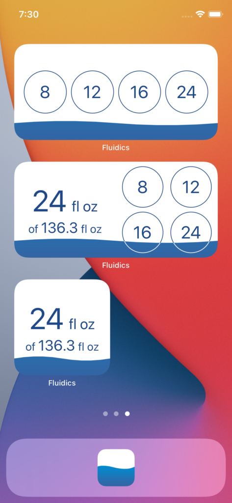
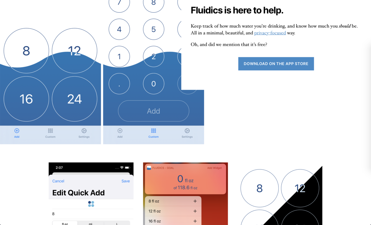
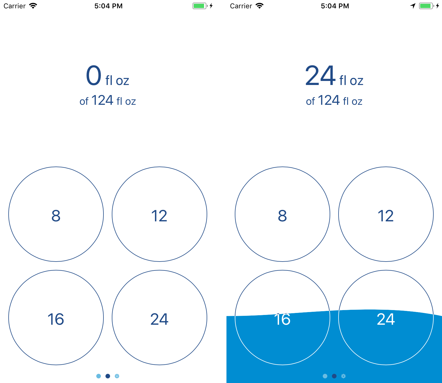
The main addition in Fluidics 2.1 is the new widgets, available with three variants.

From the top:

  • The ‘add’ widget, which displays the four Quick Adds, and allows one-tap logging from the home screen.
  • The ‘status’ widget, in wide form – my personal favorite – which displays the goal, not only in the fill state of the widget background, but also in text form, as well as the four quick adds.
  • The ‘status’ widget, in small form, displaying just the goal in text form.

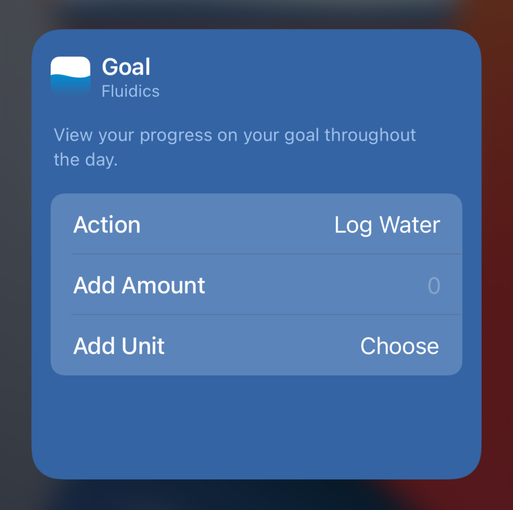
All of the widgets allow launching the app, and use deep links to interact with it in specific ways.

The linking format is technically open, so I can drop a link into this post that would open the app and log water. It accepts a handful of URLs:

  • fluidics://fluidics.app/quickAdd
  • fluidics://fluidics.app/customAdd
  • fluidics://fluidics.app/add/:unit/:amount, where :unit is one of “flOz“, “l“, or “ml“, and :amount is a parsable number.

(Creating that linking framework was the spot where I was most tempted to drop SceneDelegate entirely – the Scene class’ onOpenURL(perform:) modifier was looking real nice compared to the tangle I wound up with in the SceneDelegate. Oh well, maybe for next update.)

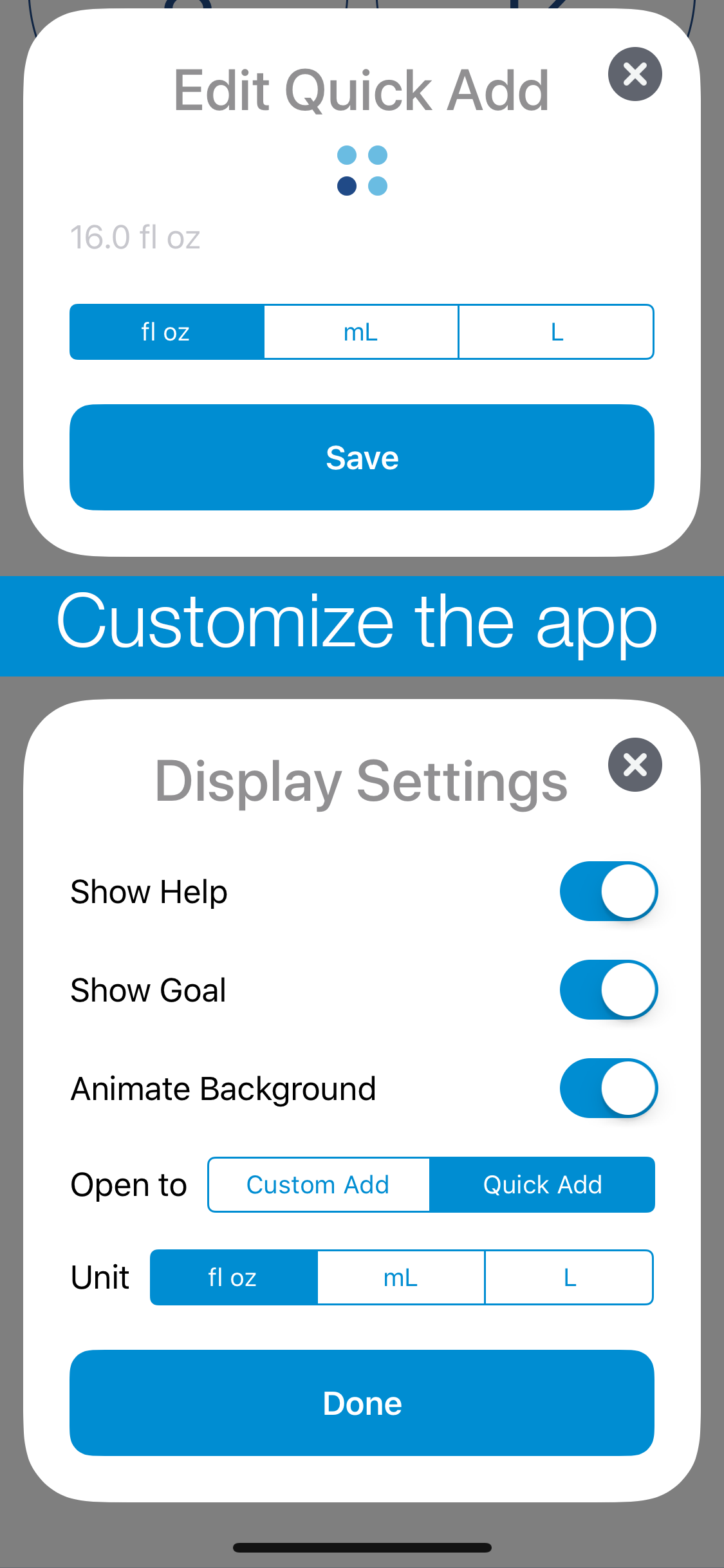
One of the fun things to set up was the customizability of the widgets. I’ve bounced off the IntentKit framework in the past, but never got very far due to time constraints. With widgets being driven off Intents as well, though, it was time to sit down and actually write it up.

Screenshot of the widget editor.

Honestly, the Intent definition editor is cool. I could go off on a whole mini-essay about the usefulness of constraints in design, and how perfectly it expresses the constraints of valid inputs and configurations, but I digress.

Having done that bit of setup, I’m definitely going to look more at this in the future. I’m still trying to figure out what, exactly, a SiriKit integration for Fluidics should look like; once I’ve done that design work, though, the coding aspect is seeming much more manageable now.

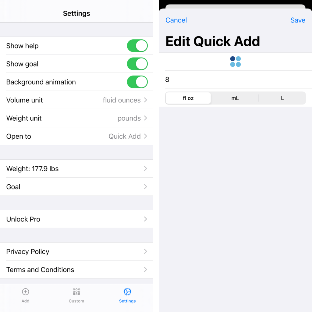
The last little feature I added was the ability for Pro users to switch the icon. It felt like the right kind of thing to lock behind the Pro subscription – a purely cosmetic tweak, and an additive change. Actually implementing it in SwiftUI was fun – it’s a Picker, attached to a custom Binding. I should probably refactor it a bit for readability, but the actual implementation is pretty solid, and I’m happy about it. It also allows for further expansion in the future – I can add new icon choices pretty easily, going forward, and may do so if I have any fun ideas for what to offer there. And yes, I’m open to suggestions.

So, the new release is live on the App Store, and I encourage you to check it out. The app remains free to use. If you’d like a more marketing-speak-y overview of what’s new, you can check out the release post.

Categories
App

Fluidics 2.0

At long last, I am quite happy to share that Fluidics 2.0 is now available on the App Store. If you’d like to see the full feature list, check out the release post over on the new Fluidics website; this is going to be more of a ‘making of’ sort of post.

So, what’s new in Fluidics 2.0 that warrants it being Two Point Oh?

To start with, I rewrote it from the ground up. Which is widely considered to be a bad idea, but I stand by the decision. I built Fluidics as a project in undergrad; while that wasn’t all that long ago, I’ve learned a great deal since then.

And beyond that, the iOS world has changed. Fluidics 1.0 was built on storyboards and imperative programming; Fluidics 2.0 is entirely SwiftUI. (The only storyboards present are in the widgets, which… cannot be built without storyboards. Maybe in SwiftUI 2.0?)

And while I wanted the core of the application to stay the same – I love the visual of the screen filling up, and the way the colors transition from the ‘above water’ to ‘under water’ areas never fails to make me smile – I also wanted some of the more idiosyncratic stuff to… fit in better.

Screenshots showing the new Settings and Quick Add screens, which match the iOS design language.

That iOS-y Feeling

Gone are the cards.

Settings is now a full-screen experience, and that extra room to breathe makes for a lot easier navigation.

For the Quick Add, I went with the new style of cards in iOS 13, which are just as easy to dismiss thanks to the universal swipe-down gesture, and have fewer… weird bugs.

One of the key ideas of the design program I’m doing right now is that “you are not your user.”

Which, in this case, meant I had to buckle down and accept what my actual users kept telling me. Cool as I think it is to swipe from screen to screen, other people mostly just found it confusing. Tabs? Tabs are standard for apps, which makes them easy to understand; they’re also very well-integrated with VoiceOver, which is something the swiping always struggled with.

Dark Mode

SwiftUI also comes with effectively free Dark Mode support. Most of the actual work, for me, was in finding slight variations on the colors that looked as good in Dark Mode as the originals did in Light Mode. (Day Mode?)

Finally, this new version of Fluidics is something like a tenth the size-on-disk of the previous. This comes from a few places: some actual clean-up work I did helped, but the biggest gains were from updating to the latest version of Swift; that means that, instead of including Swift itself in the app, I can just use the system-level one. So it’s iOS’ problem to keep track of that whopping couple of megabytes of code, and not Fluidics’. Nice.

Similarly, switching to iOS-standard cards instead of the custom ones saves some room. While I was working on dependencies, I switched from a weird, all-local, very-unstable implementation of StoreKit to RevenueCat, which is much easier to work with and saved me a great deal of tearing out my hair.

The final big change was a bit of a side project itself: a new website for Fluidics. The old one was… fine, I suppose. It gave me a chance to try out static site generation with Jenkins (on GitHub Pages), but… hand-coding HTML and CSS, while something I can do, isn’t something I really enjoy doing.

Screenshot of the new Fluidics website, fluidics.app

WordPress

In the interim, however, WordPress has had some excellent updates, the Twenty Twenty theme is easy enough to tweak, and Gutenberg with some plugins makes for a very good editing experience, so here we go.

The new site looks better, and makes it a lot easier for me to do things like, say, having a blog where I can do visually-interesting update notes for each release.

Categories
App

Meditime 1.1: The Siri Update

I am happy today to announce the release of the first major update to Meditime!

There are two major changes in this, and I’m going to start with the one that isn’t mentioned in the title: animations! After some tinkering, the opening/closing circle with the start/stop of the timer is now much smoother, and I went ahead and reused it in the transition to and from the new Settings page, as well.

The second new animation plays behind the timer as it runs, a slow up-and-down motion to help you focus on your breathing.

(A video would’ve been more clear here, but frankly, I don’t feel like embedding videos on this site is worth the effort.)

It’s a five-second inhale, five-second exhale cycle, giving you a total of 6 breaths per minute, which is a nice, calming rate. Not a huge addition, but one I am very proud of.

The other big change is the new Settings page; rather than just the privacy policy, I wanted a place to hide a bit more of the complexity that adding new features requires.

Starting from the bottom, I’ve added the ability to change the granularity of timer adjustments, and switched the default from 1 second to 5 seconds. If you really do need that timer running for 33 seconds precisely, you still have the ability to set that, but if you prefer round numbers and didn’t enjoy trying to swipe just right to make that happen, the new 5 second or 30 second increment options make that a lot easier.

Finally, the big change: Siri support!

The obvious parts are the new ‘Add to Siri’ buttons there, to start the stopwatch and end the current session. It’s pretty handy — thanks to Siri’s integration with the HomePod or AirPods, you can now make your interactions with the app an entirely hands-free experience.

Less obvious is the fact that the app is also linked into the Siri Shortcuts system. Every time you start a timer or stopwatch, and every time you end the session, that’s fed to the system as a potential suggestion for Siri to show you. And it links in with the Shortcuts app, as well, so you can add meditation to your “good night” Shortcut routine. (Or “good morning,” or anything else you’d like!)

Every time you set and run a timer, that gets handed to the Shortcuts system, and you can pick those up via the Shortcuts App or through the Settings > Siri & Search, where you can set custom Siri Shortcuts. They work just as well as the two provided in the app’s settings page, but provide a larger range of customization, for the power users out there.

Thank you for reading, and I hope you enjoy the new update! If you don’t have the app, not to pressure you or anything, but you’ve already read this far, it’s only $0.99, and I’d quite appreciate your patronage.

Categories
App

Fluidics 1.3: the Subscription Update

I was originally going to call this one “the widget update,” but that felt a bit dishonest, because that’s not the biggest user-facing change of the update.
As somebody who wants to have a nice, long career making software for people to use, I’m rather invested in the idea that it should be possible to make a living by… making software for people to use. The original business model for the App Store, then, was a bit iffy: the user buys your app and then they have it indefinitely. Good for them, except with the developer no longer making money, they no longer have any incentive to maintain the app.1 Bad news for the user, as the app is no longer getting new features, or even maintained to stay functional on the latest versions of the operating system.
Which is why I’m rather a fan of the subscription mechanic that Apple started giving developers recently. Ongoing revenue means ongoing support; that’s why, for example, I jumped at the chance to support my favorite writing app when they shifted to a subscription model.
With this update, I’m adding a subscription to Fluidics. Thus, the title of the update; it’s definitely not a hidden thing I’m doing here.
I’m also not taking any features away; everything that was available for free in 1.2 remains free.2 The subscription is titled ‘Pro,’ and the goal is for it to provide access to a variety of new features. Initially, there are two: with a Pro subscription, you can apply your own multiplier to your daily goal, from 0.5 to 1.5; and there’s now a second widget option, displaying your progress towards your goal and a single Quick Add button that can cycle through all of your Quick Adds with a tap.
I also want it to be pretty cheap, so it’s about as low as it can go: a dollar a year.
These aren’t the only Pro features I have planned — I’d like to add a few more things that I think will be quite handy. There will be new features for the free version of the app, too; in this update I’ve added a new ‘Goal’ card (in the Settings screen) that shows how the app is calculating your goal. It’s color-coded, I’m quite proud of it.
So that’s the long and short of it: in order to fund ongoing development of the app, there’s a new $1/year subscription that’ll get you some ‘Pro’ features; the core functionality is still free, but if you want a bit more power, it’s there at a very reasonable price.
As always, thank you for reading, and I hope you’ll download Fluidics; it’s free on the App Store.


  1. For a while, this worked out okay, thanks to the explosive growth of the iPhone; the growing customer base of the App Store meant there was functionally infinite growth of your target market. Now that some absurd proportion of the world population owns a smartphone, though, that growth has slowed down. 
  2. I am, admittedly, kicking myself a little about not keeping the “different units per Quick Add” as a ‘pro’ feature, but oh well, I decided I wasn’t going to take anything away from anyone. 
Categories
App

Fluidics 1.2: the Settings Update

I’m happy to announce the release of Fluidics 1.2! This update focused on the settings of the app and customizability; the quickest summary I can give is to include one of the new App Store images:

The first thing to notice is the new cards; they come up from the bottom of the screen, which is a much nicer experience on really tall devices like the iPhone X, and offer a more customizable interface than iOS built-in popup stuff.1
There’s some uses of the cards that I’m not showing here — I rebuilt the onboarding process, that initial setup you go through the first time you open the app, using this card style, and the result looks a lot nicer. There’s also some informational stuff — a new ‘about’ card, the weight/Health connection stuff, and so on — but the biggest things are the two cards in that screenshot. The first is, in my opinion, the more interesting: each Quick Add now has its own unit. If you’re content with the old system, all of them using the same unit, nothing’s changed; the text of the buttons is a bit bigger, but there’s no additional use of space. If you, like me, use a mix of units,2 you’ve now got the option to do that in one place, without needing to go over to the Settings page to switch back and forth all the time. These mixed-unit quick adds, as always, work both from within the app and from the widget.3
Next up is the new Display Settings card; this brings in features I’ve been wanting to have for a while now. Some of the original settings are still there — you can, as before, show or hide the help as you need it, and the ability to select the global display unit has been expanded to include liters as well as mililiters.4 There’s some new settings in there, too: you can choose which page of the app will come up when you first open it — useful if you’ve got your Quick Add values set just right to always work with the widget, and you only need to get into the app to add the occasional weird amount via the Custom Add page. You’ve also got the option to hide the goal display — you’ll still get the nice filling-up of the background, but without the actual number right there, it’s a lower-pressure environment.5 Finally, you can disable the animation of the background; though I spent quite a while making sure it’d work, I know that some people don’t actually want lots of animations going on.6
I also put a bit of polish on the way the Health connection works, so now it’s a single button in Settings that opens up a different card depending on the context — if you haven’t done all the connecting to Health, it’ll give you the option to do that, or leave things as they are; if it is connected to Health, but you haven’t got your weight logged there, you can continue using Fluidics’ built-in weight handling stuff. That’s been improved, as well, and now lets you pick units yourself, instead of going with the default for your region.7
Not mentioned in the release notes, but something I feel like mentioning here, is that I’ve done a bit more groundwork to prepare the app for eventual internationalization. There’s still a lot more ground to cover in that regard, though, so probably I won’t be adding additional languages for another couple versions.8
All that said, I’m pretty happy with where this version is, and I’m also excited to start work on the next big update; the feature list I’m aiming for is pretty neat. Fluidics remains free on the App Store, so please, give it a download.


  1. The specific implementation I’m using is this open-source project; I liked the way the API worked, though the documentation is a bit out of date. 
  2. Because ‘Murica. 
  3. Unfortunately, I had to reset the quick add settings as a result of this transition; the new way they’re stored is thoroughly incompatible with the old way. If you were just using the default ones, you won’t notice any change, but I wasn’t able to come up with a good way to transfer over customized settings. The issue is people like me, who used fluid ounces sometimes and milliliters other times; there’s no good way to combine eight possible options into four spaces without messing something up for someone. 
  4. I also tweaked the way amounts are displayed, so using mixed unit stuff doesn’t result in a downright stupid amount of decimal digits; I don’t think it really matters to anyone that you’ve had 101.327 fluid ounces to drink today, probably you’re alright with just 101.3. 
  5. There’s probably a joke in there about hydraulic pressure, but I’m too lazy to come up with it. 
  6. By default, it’s on, unless you have ‘reduce motion’ enabled on your phone, in which case it’ll default to having the animation disabled. That said, if you’re like me and have ‘reduce motion’ on just to get rid of the somewhat-nauseating parallax effect on iOS’ home screen, you can turn Fluidics’ animation back on while still leaving the global ‘reduce motion’ setting on. Nitpicky details, woo! 
  7. Shoutout to the UK, who can now use pounds, kilograms, or stone for weights; I may mock the US for our weird use of mixed units, but I think the UK is even worse about that. 
  8. At that point, it’ll probably be Spanish and German, since those are the ones I can manage without hiring a translator, but if anyone really vehemently wants a different language, feel free to leave a comment and I’ll see what I can do. 
Categories
App

Meditime

I’m quite happy to announce that I now have another app available on the App Store!1 Before you click, I’ll warn you, this one isn’t free, but the App Store has always encouraged trying a variety of business models, and “paid up front” was next on my list;2 $0.99 seemed a fair asking price for a lightweight utility.

The core concept of Meditime came from a podcast I was listening to.3 The idea is this: why do all the meditation apps have to be guided meditation, or come with ten million different settings, or decide what you should be listening to while you meditate? The point of the whole thing is to clear your mind, after all, and personally I’ve never had any luck with doing that while somebody is talking at me, and the lovely sound of water in a creek mostly just makes me feel like I need to use the restroom.

So, as with my previous app, having found nothing that I actually liked, I muttered “fine, I’ll do it myself” and opened Xcode.

The result is what I honestly believe I can call the simplest meditation app out there; swipe up or down to adjust the timer, double-tap to start. Adjust the time while it’s running if you like, or double-tap to stop; and if you don’t want a timer at all, drag it all the way down to zero, and it’ll run as a stopwatch, instead. At the end, the app will automatically log the session to the Health app, so you can keep track of it all nicely.4

As I said, the app is $0.99, but there’s no ads, no in-app purchases to ‘upgrade’ anything, and that one purchase will work on iPhone, iPad, and the iPod Touch, assuming Apple still makes those.5 And I’m already planning to update it to work well on iOS 12, including a little bit of support for the fancy new Siri Automation things. So, hopefully you can see the value, and if you’ve got a buck to spare, I’d quite appreciate it if you’d give it a try.

  1. In case you missed why that says “another,” have a look here.
  2. Still to go: free with in-app-purchases and subscription-based; I’ll be skipping the ‘free with consumable in-app purchases’ because apps made that way are generally terrible and at least a little bit immoral.
  3. And no, that isn’t a direct link to the episode, because I’m not certain which episode it was, although a reasonable guess would be this one, although there’s also a chance it was this one; either way, Do By Friday is a great podcast and I recommend it. Although not, I should add, to children, everyone involved does enjoy swearing.
  4. It’ll work without doing that, though, too; if you don’t want it saving to the Health app, just don’t give it permission to do so, and it won’t bug you about it.
  5. It requires iOS 11.4 to run, so hopefully you’re all up-to-date, as you should be.

    And saving to the Health app will only work on devices that have it, so the iPad won’t do that, but if Apple does decide to add the Health app to iPads, it’ll start working there, too. (I can’t comment on whether or not the iPod Touch can do that, because I genuinely have no idea if they support Health or not. Seriously, does Apple even make those anymore?)

Categories
App Portfolio Technology

Fluidics 1.1: The Animation Update

The first major update to Fluidics is now available on the App Store!1 In all honesty, it was largely a ‘bug fixes and performance improvements’ update, but I’ve always hated when app updates list that, so I made sure to include a couple user-facing features so there’d be something fun to talk about, at least.
In this case, those features were animations. The most notable is the background – rather than being drawn once, the ‘water’ in the background is now animated, which I think makes the visual effect much nicer overall. Swiping between the three main pages of the app is also much smoother now; instead of a single ‘swipe’ animation being triggered by any swipe, it directly responds to your swipe, so you can change your mind about which direction to swipe halfway through, and it feels more like you’re moving things around, rather than switching pages.2
The big changes, though, are largely invisible; a whole lot of work on the internals to allow for future features I’m planning.3 The gist of it is that a lot of the internals of the app are now a separate library, which means I can share code between the widget and the main app without needing to copy-and-paste all the changes I make in one place to the other.
Past that, there were a couple little tweaks — the algorithm that calculates the water goal is a bit less aggressive with the way it handles workout time, and there’s now a little “this isn’t a doctor” disclaimer in the Settings page that I put there because the lawyer I don’t have advised that I do that.
And, the bit that turned into more of a project than I thought: VoiceOver support. VoiceOver, for those that don’t know, is one of the core accessibility features of iOS; when enabled, it basically reads the contents of the screen to the user, making it possible for visually-impaired people to use iOS. By default, any app built on UIKit has some support for VoiceOver, but the further you go from the default controls, the more broken that’ll get. The way Fluidics works, it was super broken; technically useable, but downright painful to do. After a day or two of vigorous swearing and arguing with the Accessibility framework, I’m proud to say that Fluidics is now VoiceOver-compatible.
If you’ve already got Fluidics on your phone, it’s a free update from the App Store.4 If not, the whole app is a free download from the App Store, and I’m hoping that you’ll enjoy using it. Leave a review or whatever; I’m trying not to be pushy about that.
Oh, and I’m in the process of updating the app’s website; I got such a good URL for it that I want it to look good to match.


  1. There was a bugfix update earlier, version 1.0.1, but that’s not at all exciting, so I didn’t bother writing anything about it. 
  2. If you’re curious, this involved rebuilding the entire interface, from three separate pages that’re transitioned between to a single page that’s embedded in a scroll view. 
  3. And no, I won’t be telling anybody what those are just yet; I don’t want to promise anything before I know for sure it’ll be possible. 
  4. In fact, it may have already been automatically updated — the easiest way to tell is to open the app and see if the water is moving or not. 
Categories
App Portfolio Technology

Open-sourcing Variations

Now that the whole concert is over, and I’ve finished going through approximately all of the WWDC sessions, I’ve decided that Variations won’t be receiving any further development — it wasn’t going to be enough of a priority for me to do it any justice, and I’d hate to half-ass it.1 The app will remain on the App Store, for now, though if it breaks in future iOS versions, I’ll probably pull it entirely. Instead, I’m releasing the source code, as-is; if you’d like to look through it, it’s right here.
I had fun building it, and I like to think that it does some interesting things with the implementations under the hood, so hopefully somebody can find some use from it.


  1. This is, hopefully, a hint about some of my other projects that are a higher priority; announcements of those will, of course, show up on this here blog. 
Categories
App Music

Variations on the Theme of Life

Grey Patterson

Download on the iOS App Store
I have always been fascinated by the emergent properties of mathematics: simple rules create complex structures. When you get down to it, this is how all of our modern technology works. Variations is based on that concept and was composed for performance through an application written for the iOS® operating system.
At the core of the application are cellular automata based on Conway’s Game of Life (1970), which is a grid where each square is either ‘on’ or ‘off’ and follows a strict set of rules. A square that is off (‘dead’) can become alive (be ‘born’) if it has the right number of living neighbors. A square that is alive can die if it has too few (loneliness) or too many (starvation) living neighbors. The rules are simple, yet they can create astonishingly complex patterns; there is an entire field of mathematics devoted to studying these patterns, Automata Theory.
Variations allows these patterns to play out both visually and aurally. Tap the screen to allow the grid to move through another cycle of living and dying, or just listen to the music created by a single frozen moment. No two people will ever hear the same set of sounds: the starting point for the patterns, as well as their evolution, are uniquely generated every time the Variations application is run.

(The recording above is from the premiere, in which the audience was asked to open the application simultaneously.)

Categories
App Portfolio

Variations on the Theme of Life

Tap here to download the app on the App Store!
I have always been fascinated by the emergent properties of mathematics: simple rules create complex structures. When you get down to it, this is how all of our modern technology works. Variations is based on that concept and was composed for performance through an application written for the iOS® operating system.
At the core of the application are cellular automata based on Conway’s Game of Life (1970), which is a grid where each square is either ‘on’ or ‘off’ and follows a strict set of rules. A square that is off (‘dead’) can become alive (be ‘born’) if it has the right number of living neighbors. A square that is alive can die if it has too few (loneliness) or too many (starvation) living neighbors. The rules are simple, yet they can create astonishingly complex patterns; there is an entire field of mathematics devoted to studying these patterns, Automata Theory.
Variations allows these patterns to play out both visually and aurally. Tap the screen to allow the grid to move through another cycle of living and dying, or just listen to the music created by a single frozen moment. No two people will ever hear the same set of sounds: the starting point for the patterns, as well as their evolution, are uniquely generated every time the Variations application is run.

Categories
App Portfolio Technology

Fluidics

I made an app! I’m quite excited about it; this is, after all, the sort of thing I want to spend my career doing.

The app is called Fluidics, and it’s for tracking the amount of water you drink. As I mentioned a while back, I like to do a lot of tracking of what I’m eating and how much I’m drinking. That first part wasn’t too hard; there’s a variety of apps on the App Store for logging food, and after a while I was able to find one that wasn’t too bad.1 For water, though, nothing quite worked – Workflow came closest, but using it to do the sort of goal calculations I wanted was on the line between clunky and painful, and it’s such a general-purpose app that it felt visually lacking.
Eventually I remembered that I’m a computer science major, and why am I sitting around complaining about the dearth of options when I’ve basically got a degree in making the dang thing. Months of sketching, programming, swearing, and repeating the whole thing eventually lead to this: what I hope is the easiest water-tracking app on the App Store to use.
It’s been a fascinating process. (Here, by the way, is where I’m going to take advantage of the fact that this is my blog for rambling and start talking about what it was like making it; if you’d like to get more information on the app, I’ve put together a rudimentary website, or you can skip straight to the ‘it’s free on the App Store’ part and give it a whirl.) As it turns out, there’s a whole lot of work involved in making an app; my original sketch was the widget and two screens. Those came together pretty quickly, but I realized that probably nobody would feel comfortable using an app if the first time they opened it it just threw up a message saying “trust me!” and then asked for a bunch of health information, so I wrote up a privacy policy and started building an onboarding flow. Which then ballooned in complexity; looking at the design files, more than half of the app is screens for dealing with something having gone wrong.2
One of the most interesting debates I had with myself during the whole process was deciding what business model to use.3 The App Store has had an unfortunate tendency to be a race to the bottom; while there’s a bit of a market for pro apps, a minimalistic water-tracking app doesn’t fit into that category. There’s also no argument to be made for a subscription, so I’d narrowed it down to ‘free, because I’m turning it in as the capstone project for my computer science major’, ‘free with ads’, or ‘paid up-front’. The first one was the one I was most comfortable with; sure, ‘paid up-front’ would be nice, but I’d also get approximately zero people to download it what with all the free competitors out there. ‘Free with ads’ feels deeply gross, both because I hate online advertising in general, and because I’m doing a lot with health data, and I really don’t want to have any chance of that getting stolen. For a while, I thought it was going to be ‘free forever’, and I’d be justifying it as ‘building a portfolio’.
That wasn’t what I actually settled on, however; instead, I’m going with ‘free with in-app purchase.’ Instead of building in a paywall and locking some features behind it, though, I decided I’d go simpler; the app and all of its features are free. Starting in version 1.1, there’ll be a button in the Settings; a little tip jar.4 I probably won’t make much, but I’ll feel better about it overall, and what’s the harm?
Beyond that debate, most of the challenge of the project as a whole was just building it. I knew going in what I wanted it to look like; what I didn’t know was how to go about doing that. The way the background overlaps the text? That alone took a week of trying different things to get working right.5 A few things I wanted to include in the first version didn’t make it – the widget was originally going to be entirely different, but the way Apple has done the security on health data makes the original design significantly more difficult to do, so I switched it to the current design.6
It was definitely a learning experience, too – I’d done some iOS application design for classes before, but never gone all-in on making something that would be both functional and enjoyable for the end user. If you’re releasing something on the App Store, you can’t just include a note that says “on first run, it’ll ask for a bunch of permissions; just say yes” because nobody will read that. And getting something uploaded to the App Store is itself a whole process – the App Store page doesn’t fill itself out, after all, and copywriting definitely isn’t my strongest suit.7
But it’s done; I’ve made an app and released it to the world. 8 By the time you’re reading this, it should be available on the App Store; as I mentioned, it’s free to download, and I’d love it if you’d give it a try.


  1. That said, I’m also doing some design sketches for my own entry into the field; don’t get your hopes up, I make no promises. 
  2. I’m not talking “my code is full of bugs and something crashed” went wrong, either; it’s all “the user originally gave permission to do something, but then changed their mind and used the Health app to take it away” and other such nonsense. Computers may be finite-state machines, but “eleventy hojillion” is still a finite number. 
  3. I also talked about this a lot with my friend Chase, without whom I would’ve long ago given up on technology and disappeared into the woods to be a Bigfoot impersonator.. 
  4. Yes, I know, I’m just now releasing version 1.0, and I’m already mentioning plans for 1.1. Don’t worry, I’ve got versions 1.2 and 1.3 mapped out, feature-wise, as well, and have some rough ideas for 1.4. 
  5. For a while I thought I was going to have to write code to draw the numbers ‘by hand’; fortunately, I was able to get the drawing to work by taking advantage of layer masks, but good lord are the Interface Builder files a mess as a result. Behind The Scenes, everybody! 
  6. I do still want to get the original design working, probably as an option in the Settings page of the app; a future version is going to add watchOS support, and I believe that a lot of the work I’ll have to do for that will also apply to making the widget work like I intended, so those two will either be the same or subsequent updates. 
  7. Another shoutout to Chase, who wrote the App Store description and turned my pile of 100 disjointed screenshots into the four that’re currently on display. 
  8. Well, “done”; it’s functional and available to the public, but software, as the saying goes, is never finished, only abandoned. I’ve no plans to abandon this project anytime soon; I use it myself several times a day, so I’m pretty invested in keeping it working and making it better.